

This page presents the features and elements that are common to all Nik Collection plug-ins. Exceptions and differences in features of certain plugins are identified in each section.
Preferences
Overview
Overview
This section shows the options and preferences common to all Nik Collection, both in plugin and standalone modes, with the following exceptions:
- The Host tab is available only when using Nik Collection from Photoshop. Please refer to the Workflow with Photoshop chapter for more details.
- The two modules of Nik Sharpener, Nik Presharpener and Nik Sharpener Output, offer additional options in the Sharp tab, which you will find in the chapter about them.
- Nik Viveza does not use your graphics processor for computation.
The Nik Collection preferences let you specify options in the following tabs:
- General
- Export
- Workspace
- Advanced
To access Preferences:
- Mac: click on the menu bearing the program name, in the top left corner, and select Preferences.
- PC: go to the File menu, then select Preferences.
General tab
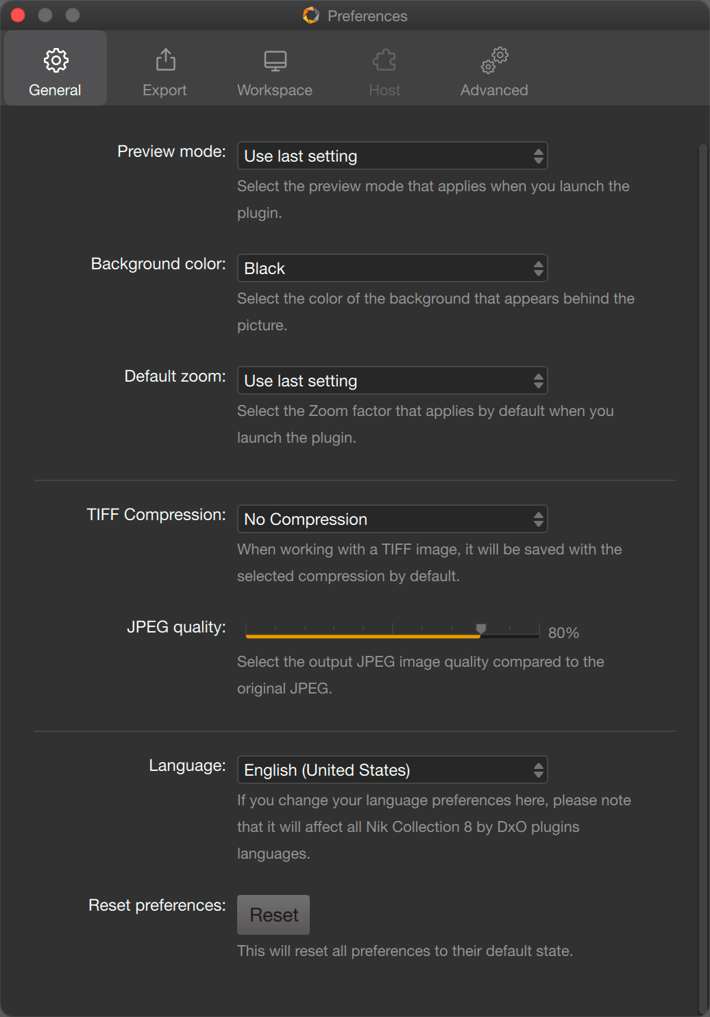
The General tab is dedicated to the general operation and behavior of the Nik Collection plugins, and offers the following options (from top to bottom):
- Preview Mode*: Lets you choose how images will be displayed when you open the app, either Single image preview, or Split preview (the image is separated by a line, with Before corrections on the left and After corrections on the right), or Side-by-side preview (the two versions of the image, before and after corrections, are displayed next to each other).
- Background color*: You can select the level of gray for the background appearance: white, gray, dark gray, black.
- Default zoom*: sets the level of zoom to be applied when the app is opened, from Fit (screen) up to 16x.
- TIFF compression**: Choose between LZW compression, which reduces file size, or no compression.
- JPEG Quality**: Lets you adjust the compression and quality of generated JPEG files when you save. The default setting is 80%, a good compromise between file size and quality.
- Language***: The Nik Collection gives you a choice of 17 languages.
- Reset Preferences: Click the Reset button to reapply the default settings and options.
* By default, if you do not change this option, the previously used setting will be applied.
** The file format settings in the General tab do not apply to the Export mode.
***Changes are applied the next time you launch the plug-in.
Export tab
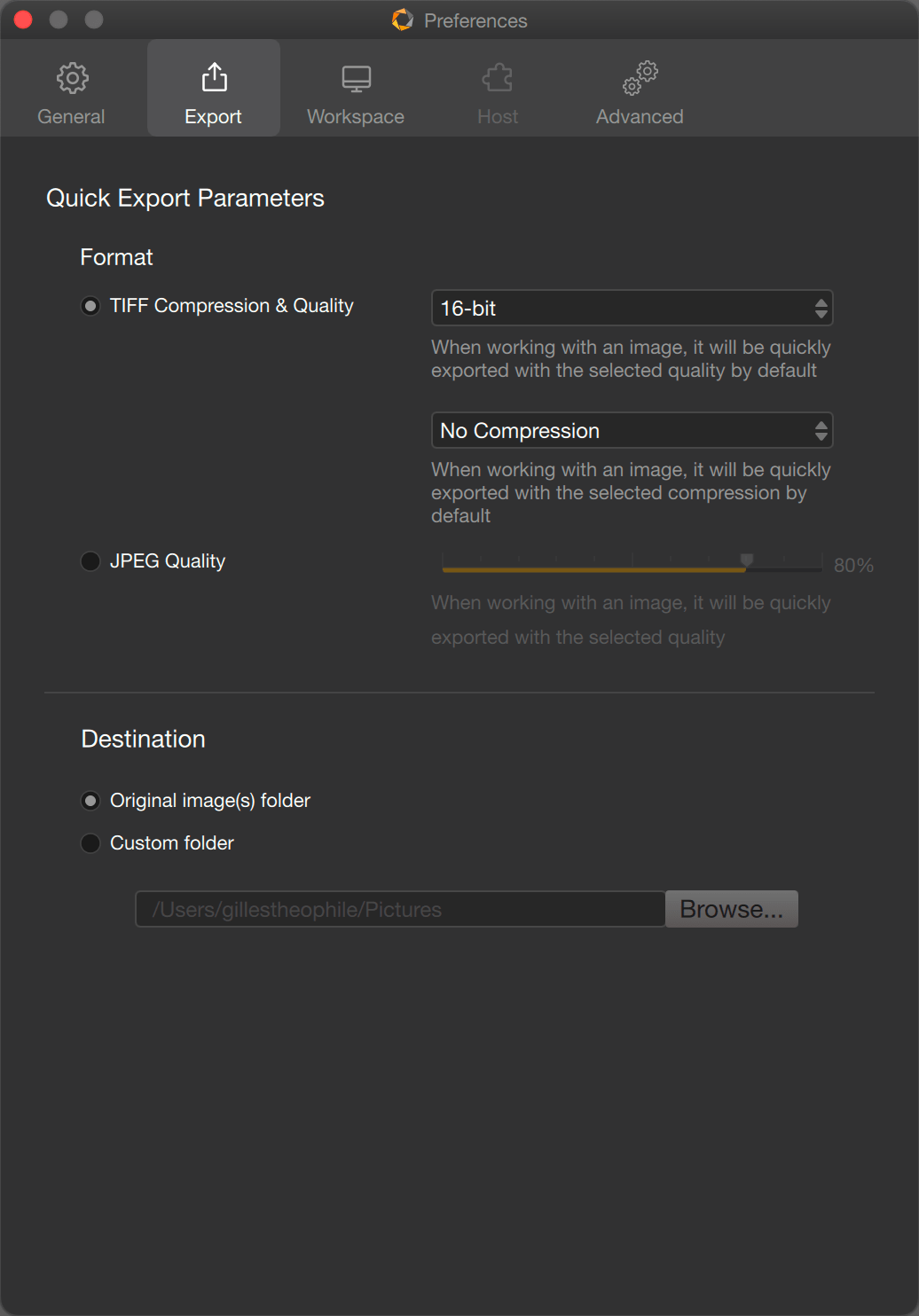
This tab is dedicated to the Quick Export mode*, and offers the following options** (from top to bottom):
- Format: Lets you select the image settings:
- TIFF Compression & Quality: Choose between 8 and 16 bits files, with no compression (default choice) or LZW compression.
- JPEG Quality: Set to 80% by default, on a scale of 0-100%.
- Destination: As the quick export mode is meant to have a quick overview of the edit results, you can choose to store the files:
- Original image(s) folder: the quick export files will show up next to the original file in your system file browser or any photo software which acts as a file browser.
- Custom folder: Click on the Browse folder and create or select an existing folder through the system dialog box.
Files created with the Quick Export mode are renamed FileName_NIK.extension (for example: DSC01234_NIK.tif).
*The settings are for Quick Export only and do not apply the save file options in the General tab.
**You need to click on the different options in order to modify them.
Workspace tab
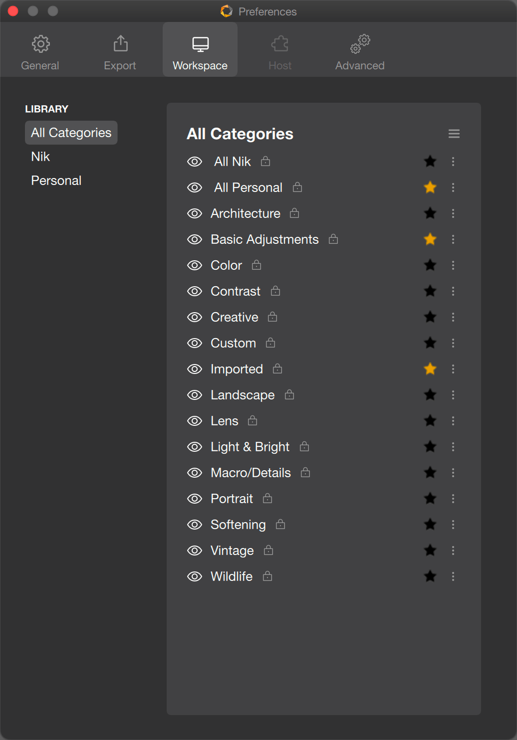
This tab lets you manage the categories’ library in the plugins, except :
- Nik Dfine, which stores only denoise profiles.
- Nik Presharpener, which has no left panel at all.
For full details about categories management, please take a look at the Managing categories, filters and presets page of this user guide.
Advanced tab
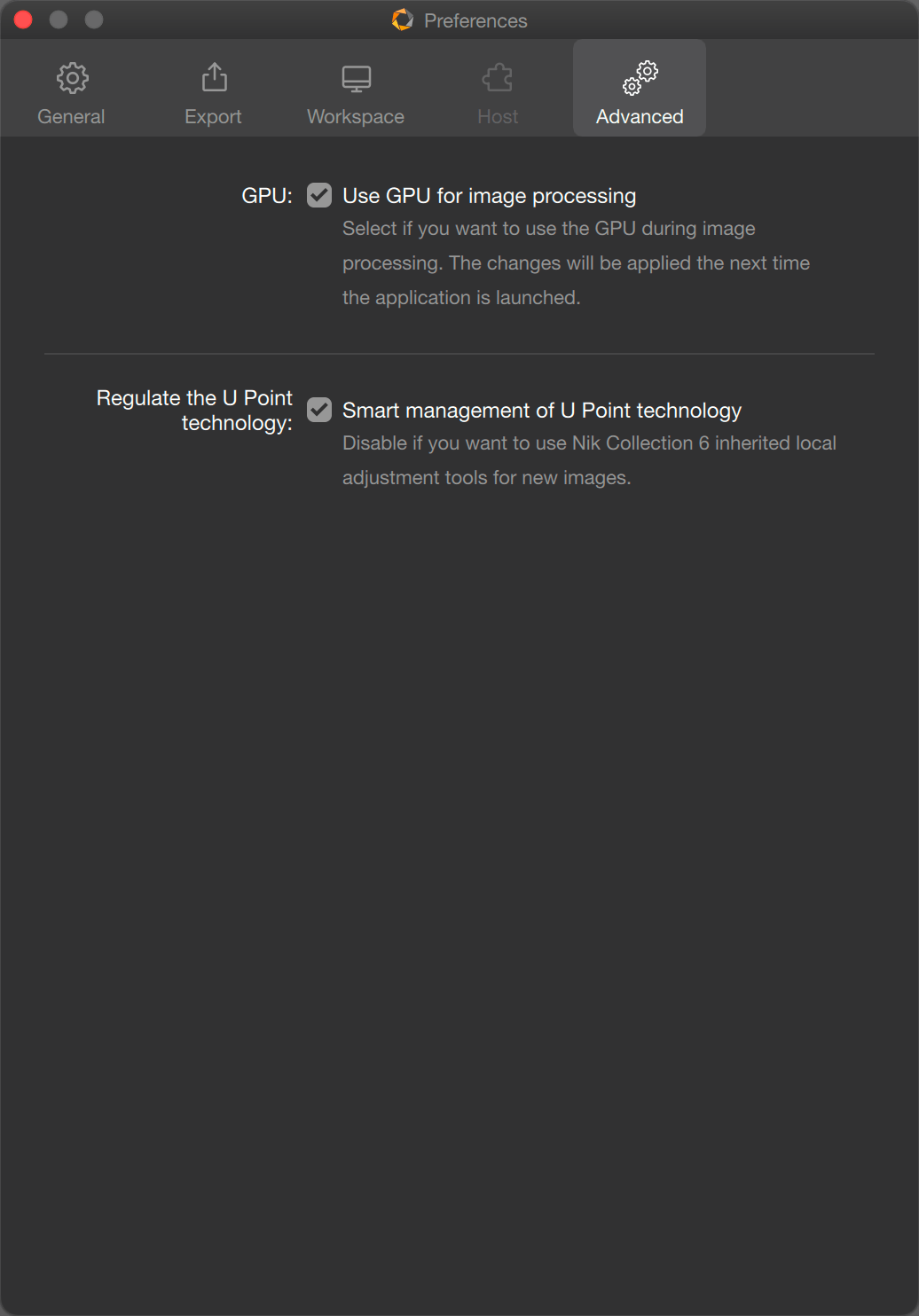
In this tab, you will be able to set the following options:
- GPU*: Check this box** if you want the plug-in to take advantage of the computing power of your graphics card.
- Regulate the U Point technology**: The Smart management option lets you display, in every plugin, a pair of buttons to toggle the Classic (pre-Nik Collection 7) and the Advanced (from Nik Collection 7) U Point tools. By default, this option is unchecked, meaning that the plugins use the Advanced mode.
*Except Viveza, which has no support for graphic acceleration.
**Changes will apply the next time one of the plugins is launched.
***For more details about the Advanced tools and behavior, please check the Local adjustments page of this user guide.
To save your Preferences:
- On Mac: click on the red button in the top left of the screen to exit the Settings window.
- On PC: click Save to keep the changes. You can exit the window without saving the changes – either click on Cancel or on the red button at the top right of the screen.
IMPORTANT
Common options or settings modified in one of the plugins preferences will apply to all Nik Collection plugins.
Interface
This page looks at the common elements of the Nik Collection interface. Individual features are presented in the relevant plugin chapters.
Overview
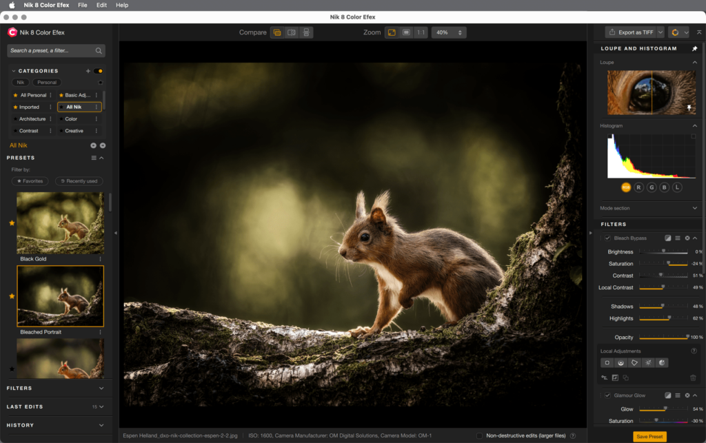
The Nik Collection interface is composed of the following elements:
- The upper toolbar
- Image display area
- Left panel (Filters and Presets)
- The right panel (tools)
- Lower bar (plugin version)
Menu bar (plugin and standalone versions)
In the plugin version, the menu bar at the top of the window contains the following elements:
- Name of the plugin (Mac): lets you access Preferences.
- File:
- Lets you access Preferences (PC).
- Export as: quick export in JPEG or TIFF.
- Edit: contains Undo and Redo options to cancel or re-apply each prior action one by one.
- Help: contains the following links (*requires an internet connection):
- User Guide*: displays the user guide page in your web browser (a PDF version is also available for download).
- Frequently Asked Questions*: shows the most common questions and answers about the Nik Collection.
- Online support* opens a contact form in your web browser.
- Learning hub*: access to learning resources (videos, webinars, etc. ).
- About: opens the plugin information window (version number, legal information and acknowledgements).
- DxO Hub: opens the Nik Collection website with What’s New and links to different resources (help, support, etc.). You can set when this window is displayed.
In standalone mode, the menu bar includes the following elements:
- Name of the plugin (Mac):
- lets you access Preferences.
- Quit to close the program.
- File:
- Open: lets you open images with a system dialog box (Mac : Finder, PC: Windows Explorer).
- Open recent: access a list of the last files you have been working on, even in the previous sessions, even if you have quit the plugin.
- Save: applies the image processing and corrections.
- Save as: applies processing and corrections, then creates another file in a different location with a system dialogue (Mac: Finder, PC: Windows Explorer).
- Export as: quick export in JPEG or TIFF.
- Save all: applies the processing and corrections for each of the open images in the program.
- Preferences (PC): lets you access Preferences.
- Quit (PC): to close the program.
- Edit: contains the Undo and Redo commands, to undo or redo previous actions one by one, as well as the Apply Last Edit command, which lets you apply corrections made during a previous session to a new image.
- Help: contains the following links (*requires Internet connection):
- User Guide*: displays the user guide page in your web browser (a PDF version is also available for download).
- Frequently Asked Questions*: shows the most common questions and answers about the Nik Collection.
- Online support* opens a contact form in your web browser.
- Learning hub*: access to learning resources (videos, webinars, etc. ).
- About: opens the plugin information window (version number, legal information and acknowledgements).
- DxO Hub: opens the Nik Collection website with What’s New and links to different resources (help, support, etc.). You can set when this window is displayed.
The upper toolbar and display modes
The upper toolbar includes the comparison and zoom tools.

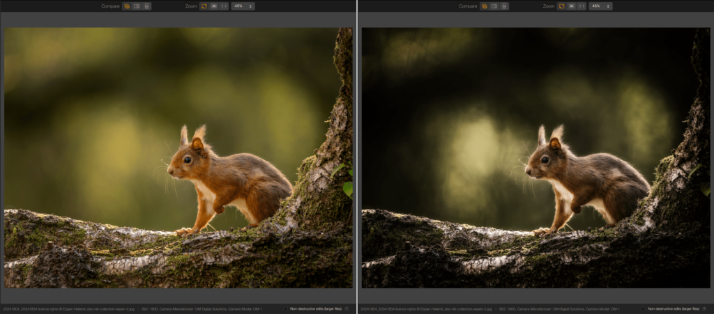
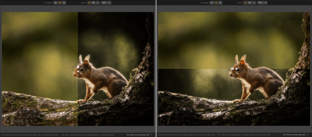
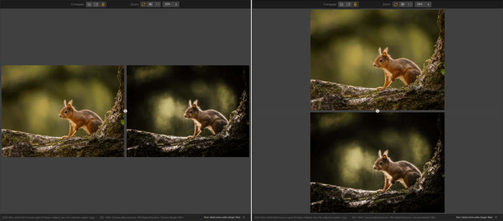
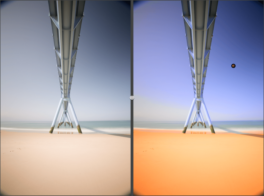
The Compare buttons let you compare your image before and after correction:
- Quick compare: click on the button to display the image before correction, release to display the corrected image.
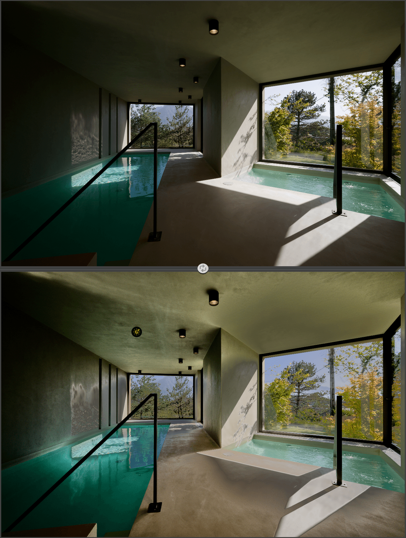
- Split compare: divides the image in two with a vertical line that can be moved left or right, or switch to horizontal mode by clicking on the arrow in the center of the line, which you can then move up or down. The left half (or upper half) displays the image before any corrections were applied, while the right half (or lower half) displays the processed, corrected image. You can zoom and move synchronously in both halves of the image, either with the Navigator or with the Hand tool (press the space bar).
- Side compare: the pre-processed version is shown at the top, the post-processed version at the bottom. You can also view the two versions of the image side-by-side by clicking on the button located between the two. You can also zoom and move the two images in synch, either with the Navigator or with the Hand tool (press the space bar).
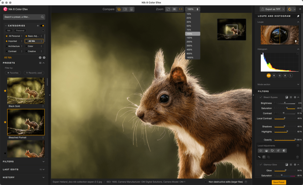
The Zoom buttons let you adjust the size and enlarge the image:
- Fit zoom: adapted to your screen size to show the full image in the image display area.
- Fill zoom: displays the image so that it fills the entire display area (the image may look cropped therefore).
- 1:1 (100%) zoom: in this mode, 1 pixel in the image = 1 pixel on the screen.
- Other zoom values: click on the arrows to select other zoom values from the menu (from 10% to 1600%). When you select one of these values, it is displayed in the button. You can also type in any value to zoom in.
Easy zoom
You can zoom in and out easily by using the mouse scroll wheel or your trackpad.
When zooming in on the image, a floating navigation window is anchored in the top right corner of the image display area (you cannot move it). You can move around the floating navigation preview window by grabbing the tile or clicking in it.
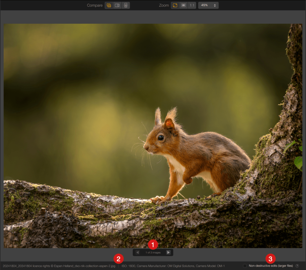
The image display area (plugin and standalone modes)
This is where the image is displayed, on a medium gray background, which you can change in the Settings.
Below the image you will find the following information:
- If you have opened several images, a floating scrollbar lets you switch between them.
- File name and extension. If the image has EXIF metadata, the shooting and equipment settings will also be displayed.
- You will also see the non-destructive changes check box and the Convert to Dynamic object check box, if the plugin was opened from Photoshop.
In the standalone version, if no image is open, the display area lets you drag images into it:
- either one by one (the new image replaces the previous one).
- or in batches, a scrollbar then lets you switch from one image to another.
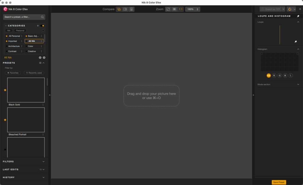
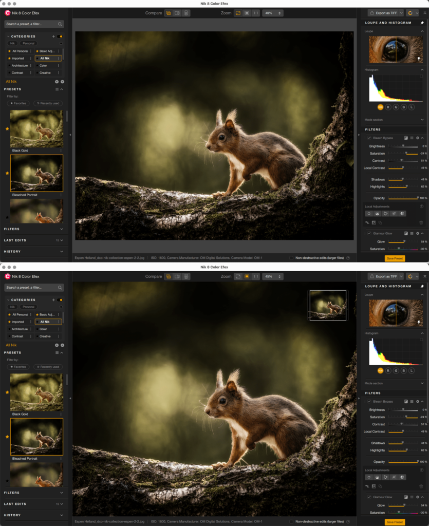
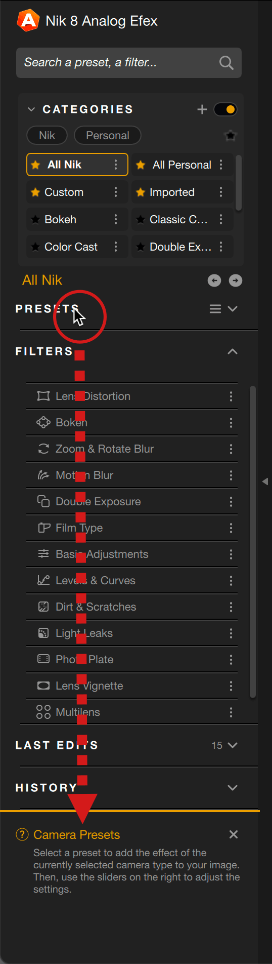
The left panel
The size of the left panel is not adjustable but you can hide or unhide it in different ways:
- by clicking the right border
- by pressing the L key
- by pressing the tab key. This will also affect the right panel.
The content of the left panel varies according to the plugin and its filters and settings, but there are common sections and functions:
- Search field
- Categories
- Presets/Filters
- Filtering by Favorites and Recently Used
- Last Edits
- History
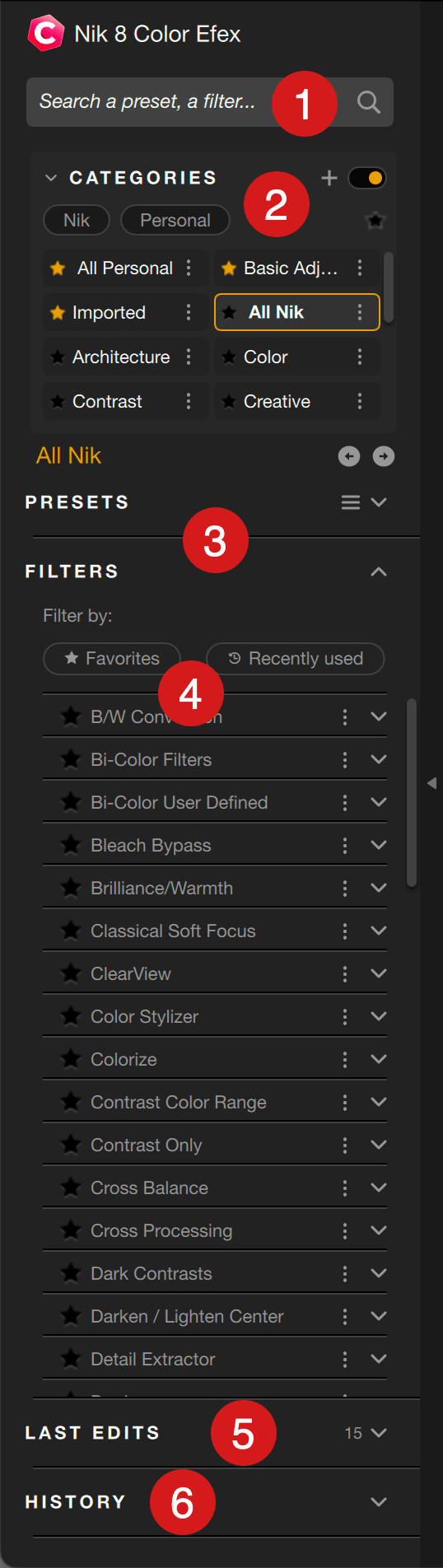
To hide or unhide the content of a section, click on the chevron on the right. The figure indicates the number of filters or presets in each section and, depending on the section, you can use the double arrow to save, import or export a filter or preset.
For further details about the categories, filters, presets and search field, refer to the Managing categories, filters and presets section of this page.
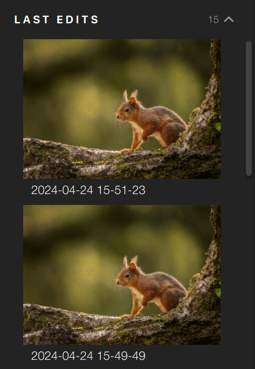
Last Edits
This section stores the last 15 corrections, filters or settings used, recorded in the form of thumbnails bearing the date and time of execution, from one session to the next.
If you hover the mouse over the thumbnail, a trash icon appears to let you remove it.
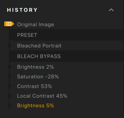
History
The History section shows all the processing and correction steps of your image, from top (oldest) to bottom (most recent).
To view the image at a particular stage, click on the stage in question in the list. The selected step is displayed in yellow, all previous steps (above) are white, and all subsequent steps (below) are grayed out: if you correct the image at this point, the grayed out steps will not be applied to the image.
In split or side-by-side display mode, you can apply a step to the left view from the history by moving the History selector (the yellow arrow on the left edge of the section).
Instant Help (Nik Analog Efex)
The Instant Help section displays tool descriptions when you hover over with the mouse, it is activated or disabled in Help > Open/Close Instant Help.
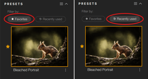
Filtering by Favorites and Recently Used
All Nik plug-ins presets and filters can be marked as Favorites by clicking on the star to the left of the thumbnail. A favorite is indicated by a yellow star, you can cancel it by clicking on the star again.
In each section you can filter the filters and settings by favorites or recently used:
- Favorites: by clicking this button, the section displays the thumbnails of the contained filters and settings.
- Recently used: by clicking this button, the section shows the thumbnails of the filters or settings you used in previous sessions.
You can combine the two buttons, the section will display the filters and the settings according to the “or” criteria. To disable filtering, click on the buttons.
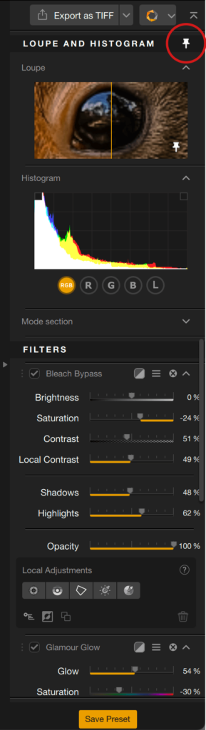
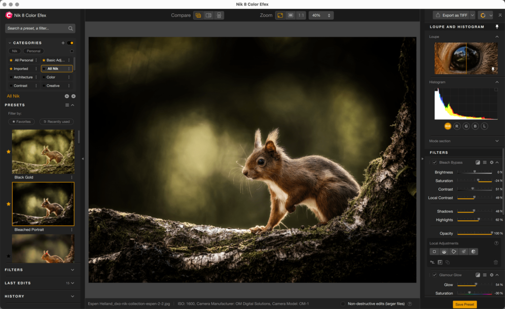
The right panel
The size of the right panel is not adjustable but you can hide or unhide it in different ways:
- by clicking the left edge
- by pressing the R key
- by pressing the tab key. This will also work on the left panel.
In addition to the specific tools for the different Nik Collection plug-ins, there are a number of common items (from top to bottom):
- Export as button and drop-down menu1.
- Switch to another plugin button and drop-down menu1.
- Magnifying loupe.
- Histogram.
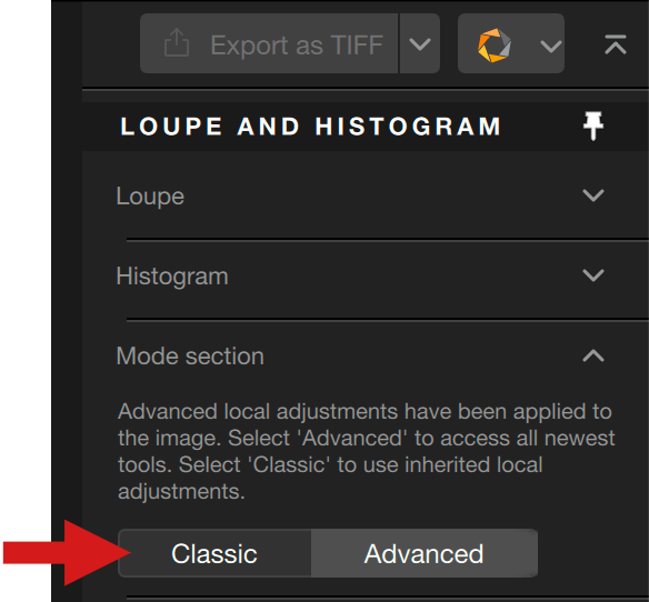
- Mode section2 to select the Classic or Advanced local adjustments.
1Whatever your choice here, the Quick Export button and the switch to another plugin menu stay visible.
2For more details, please refer to the Local adjustments section, near the end of this page.
When you scroll the contents of the right panel upwards, the Loupe, Histogram and Mode section disappear from view.
By clicking the pin located in the top right corner of the title bar of the loupe, histogram and mode selection sections, you will lock them, so that all other tools will scroll below .
Quick Export
The Quick export function will help you to save your work quickly and easy from any plugin to a preselected format and destination folder. This allows you to create, on the fly, TIFF or JPEG versions of your ongoing work. To the contrary of the Apply button, Export as won’t close the plugin and the images, which lets you carry on editing work.
The destination folder and the file format can be set for all plugins in the Preferences, Export tab. Please check the Preferences section of this page.
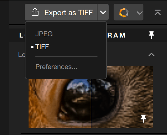
Doing quick exports
You can use Quick Export anytime during your editing session:
- Edit your image.
- Click on Export as TIFF or as JPEG, in the top right corner of the plugin. You can change the format on the fly, by clicking on the chevron, on the right part of the button. This gives you also direct access to the preferences, where you can set or change the default format and destination folder.
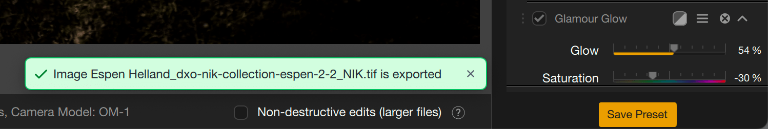
- The image is exported in the preselected format and destination folder. A message will be displayed a few seconds in the bottom right corner of the display area.
- To take a look at your exported images, use your system file browser, or any software able to browse your folders.
The exported images will not show up in the current plugin, and won’t be imported in your catalog, if you use Lightroom Classic as your host program.
Switch to another plugin
You can switch directly from one Nik Collection plugin to another, anytime, without having to save your work in the plugin currently in use, and without having to return to your host application. This will speed up your workflow considerably, both in stand-alone mode and from a host program.
In this way, you’ll be able to combine filters and effects from two or more plugins, or follow a standard workflow, such as denoising in Nik Dfine, then switching to Nik Color Efex to apply creative rendering and, finally, sharpening according to output media in Nik Sharpener, before saving your work and returning to your host program.
The edits are applied and saved each time you switch to another plugin and, in Photoshop, a new layer (or smart layer if you use the non-destructive edit mode) will be automatically created or the active layer will be updated; depending on your preferences.
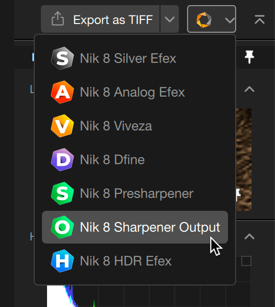
How to switch to another plugin:
- Edit your image.
- Click on the switch button chevron, in the top right corner of the plug-in.
- Select another plugin in the drop-down menu.
- The edits will be applied, and the current plugin will close.
- The selected destination plugin opens.
- Continue your edits, and so on.
If you are working in non-destructive mode, the corrections will be applied before switching to the other plugin, and non-destructive mode will be checked.
However, if you return to the first plug-in, and despite the choice of non-destructive mode:
- You will not be able to modify the edits of the first plugin if you save the edits in the other plugin.
- You will be able to modify your edits of the first plugin if you quit the other plugin without saving.
Loupe
The loupe is always visible, regardless of the tools used. You can hide it by clicking on the chevron in the top right corner of the section.
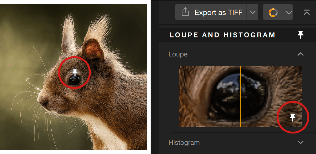
The loupe permanently displays an image that is set to 1:1 (or 100%) of the image area covered by the mouse. It is divided by a vertical yellow line, the left-hand side showing the image before processing and the right-hand side after processing.
The preview in the loupe can be locked in any place on the image by clicking on the pin and then in the image (inclined pin: inactive, vertical pin: active).
When you enable one of the zoom modes, the loupe is centred by default. You can move around the image by grabbing the tile or by clicking in the floating navigation window.
To move around in the loupe, you need to unlock the pin.
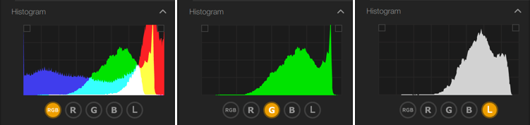
Histogram
The Histogram section is also always visible, regardless of the tools used. You can hide it by clicking on the chevron in the top right corner of the section.
The histogram shows the distribution of the brightness levels of the pixels in the selected image, with dark tones on the left, medium tones in the center, and light tones on the right, with the peaks corresponding to the number of pixels per brightness range. The histogram can show all channels or individual channels by clicking on the buttons:
- RGB: default indication, covering the 3 channels Red, Green, Blue as well as the complementary colours Cyan, Magenta and Yellow, according to the additive color principle.
- R: just displays the red channel.
- G: displays the green channel only.
- B: displays the blue channel only.
- L: displays the overall brightness values.
Because you can see brightness values by channel, you will be able to precisely set your tonality (exposure, contrast) and color preferences.
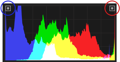
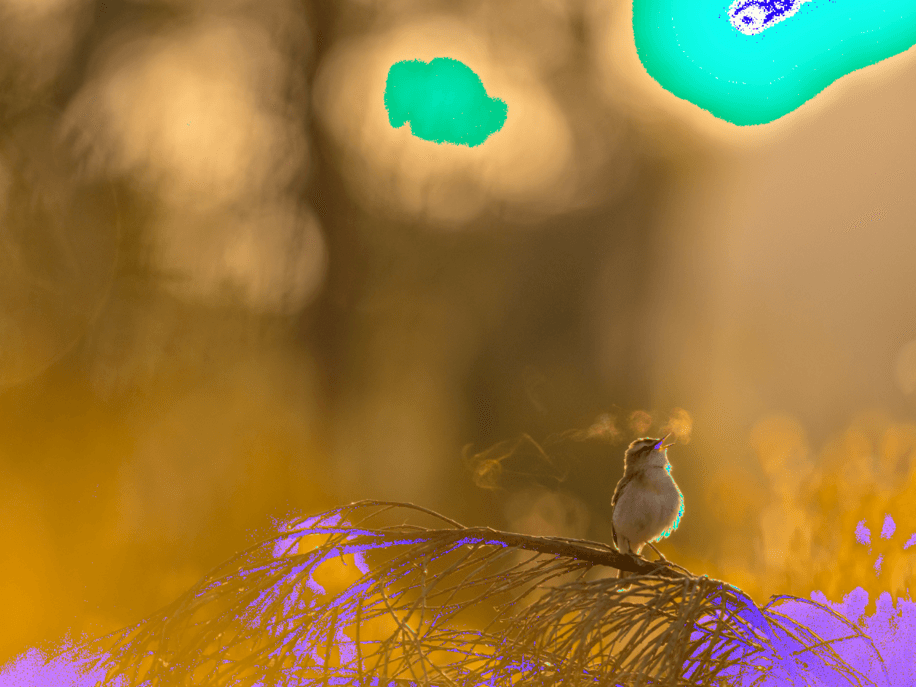
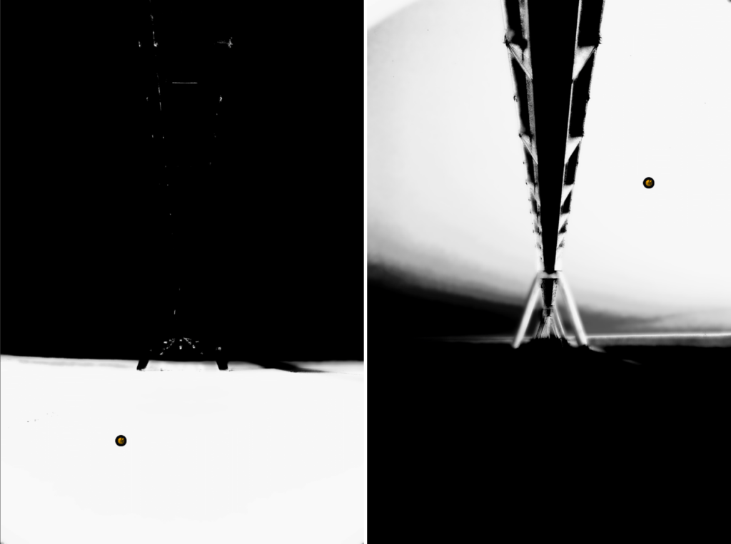
The histogram can also be used to display the clipped values in the image, shown as color masks corresponding to the RGB channel and/or the complementary color affected.
To show the clipping masks, click in the histogram or on the button(s) in the top corners: left for clipped shadows and blacks, and right for clipped highlights and whites.
The sections
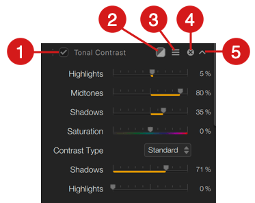
Although the tools and sliders will depend on the Nik Collection plugin and selected filter, this is also the case for the different icons found in the right panel sections*:
- A checkbox to disable/enable all section tools and settings (for a quick comparison of an image with and without corrections and effects).
- A filter effect mask option**.
- 3 lines icon to reset the tools (with the option to retain local adjustments) and copy/paste local adjustments.
- An “X” button to close the section (which also disables the effects and corrections applied).
- A chevron to collapse or expand the contents of the section.
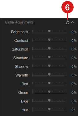
- The round arrow icon resets all edits of the relevant section to their default settings.
*Some of the plugins have additional items, such as special display options or a checkbox to toggle the edits on/off. Please look at their respective pages for more information.
**For more information about the filter mask option, please check the Nik Color Efex page.
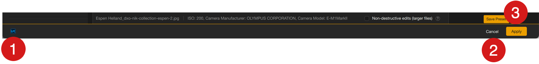
Lower bar (plugin version)
In plugin mode, the bar contains the following information and functions:
- File source: indicates the name of the host application.
- Cancel: cancels the current processing and corrections and closes the plugin. The image in the host application is not modified.
- Apply: saves the processing and corrections and closes the plug-in. The image in the host application is modified. If multiple images are opened the button will display Apply all.
Managing categories, filters and presets
Starting with Nik Collection 7 (May 2024), category and preset management, located in the left panel, has been redesigned to facilitate search, organization and user workflow. It has also been standardized across all plug-ins.
The interface
The management section of the left panel is organized as follows:
- The preset or filter search field.
- The Categories* section, presented as clickable blocks to display the presets or filters they contain. Categories are grouped into Nik categories, i.e. those supplied with plug-ins, and Personal categories, created by the user.
- A list of presets and/or filters (if applicable).
- Workspace management via Preferences.
Note that Nik Dfine and Nik Sharpener Output don’t offer “Nik” categories, filters or presets delivered with the respective plug-ins, even though the Nik category button is present.
Nik Presharpener, on the other hand, has no left-hand panel and therefore none of the management tools presented here.
The search field
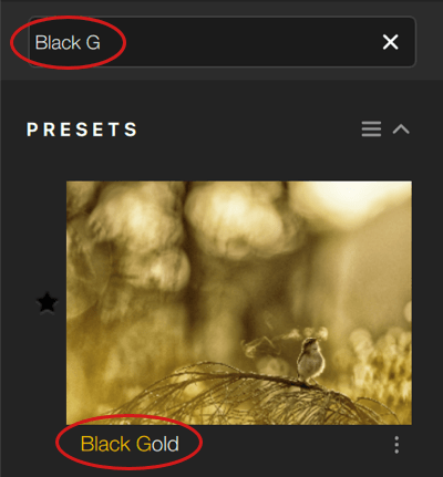
The left-hand panel features a search field for filters or presets:
- You can enter the name here, with the search starting with the first few letters.
- The list is refined as you continue to type.
- Letters entered in the search field are highlighted in yellow in the filter or preset name, below its thumbnail.
- The search is not case-sensitive, so you can enter both upper and lower case letters.
To reset the search, click on “X” in the input field.
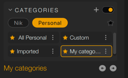
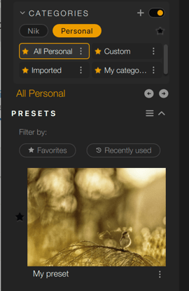
The categories
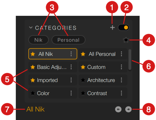
The Categories section groups together all the filter or preset categories offered by the plug-ins concerned. It consists of the following elements:
- The “+” button to create a personal category or access the workspace manager.
- A switch to disable the display of the categories section. When disabled, all items are grayed out, but you can still activate a category or filter by clicking on it (which will activate the switch).
- Filter buttons to display only Nik or Personal categories:
- By default, no button is clicked, all categories are displayed.
- A yellow button indicates the category whose display is active, a gray button indicates display not activated. Only one button at a time can be active.
- To deactivate a button, and therefore the display of associated categories, click on it.
- The star-shaped filter button for favorite categories. An activated button is yellow, otherwise grey. Filtering by favorites can be combined with Nik and/or Personal category selection.
- The list of categories presented in paving blocks.
- A scrollbar for browsing the list of categories.
- Display of the name of the selected and active category.
- Navigation buttons to move to the next or previous category.
Category boxes are presented in two columns. When a category is selected, it is highlighted in yellow, and the associated filters and/or presets are displayed below, in the left-hand panel. A white border appears when a category is hovered over with the mouse pointer. Each category box contains the following elements:
- The category name.
- The clickable star to give/remove favorite status to the category.
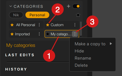
- The 3-dot menu for the following actions:
- Make a copy to: allows you to copy the contents of a category, either into an existing personal category, after clicking on the Find category field and entering a category name, or by creating a category by clicking on the Create button (a dialog box allows you to enter the name).
- Hide: hides the category in the Categories section.
- Rename: changes the name of a personal category.
- Delete: deletes the category and its contents (the contents remain available in the Custom or Imported categories, or in the native Nik category from which the preset originated).
*Applies only to personal categories. A Nik category cannot be renamed or deleted.
The Imported and Custom sections of versions prior to Nik Collection 7 (May 2024) have been integrated into the Categories > Personal section.
The filters and the presets
With Nik categories
If you click on a Nik category, a list of filters and/or presets will appear below it, in the left-hand panel. The items displayed depend on the plug-in used:
- Nik Analog Efex: displays, in list form, preview thumbnails of cameras and camera kit tools employed by the selected category.
- Nik Color Efex: displays a list of filters and presets, and clicking on the chevron to the right of each filter name unfolds thumbnails of the presets and their variants.
- Nik Dfine: the Nik category contains no filters or presets (custom denoising profiles can be accessed via the Custom button).
- Nik HDR Efex, Nik Silver Efex, Nik Viveza: displays, in list form, preview thumbnails of the relevant plug-in’s presets.
- Nik Presharpener: no filters or presets.
- Nik Sharpener Output: the Nik category contains no filters or presets (custom sharpening presets are accessible via the Personal button).
With Personal categories
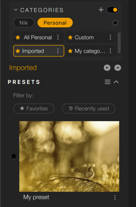
By clicking on Personal, the following categories are displayed*:
- Imported: contains all presets shared by other users (or your own presets that you wish to add to another Nik Collection session, on another of your computers) and that you will have imported into your own Nik Collection sessions.
- Custom: by default, contains all presets created in Nik Collection plug-ins. You can copy them into any custom category (right-click on Custom > Find, select or create category).
- Any personal category you’ve created.
Except Nik Presharpener, which has no left panel and no category, filter or preset manager.
Workspace management
You can also, in each plug-in, switch to the preferences to set up your workspace in the left-hand panel, to display only the categories you want.
To access these settings :
- In the Categories section, click on the “+” then, in the context menu, select Manage your workspace, which will open the preferences window, in the Workspace tab.
- Open the plug-in preferences, then go to the 3ᵉ tab: Workspace.
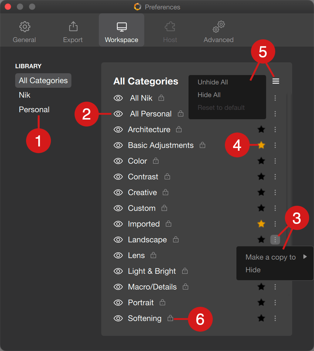
On the left, you can filter by category family. Here are your options:
- Select categories (All, Nik, Personal).
- Hide/show the desired category by clicking on the eye.
- Hide the desired category by clicking on the 3 dots > Hide (to display the category again, click on the eye).
- Set a category as a favorite by clicking on the star.
- Use the 3-dot menu to copy the contents of a category into a personal category. At this stage, you can also create a category, and a search field makes it easy to find a category if your list grows. You can also rename your personal categories.
- A padlock to the right of the name indicates a category delivered with Nik Collection, which means you can’t modify its content*, rename it or delete it (you can only hide it if, for example, you don’t use it).
*However, you do have the option of modifying a Nik category after copying it into the Custom category. There, you can remove or add the tools you want).
Note that all changes made in the Workspace tab of the preferences apply immediately and, therefore, do not require a restart of the plug-in concerned.
Create a category
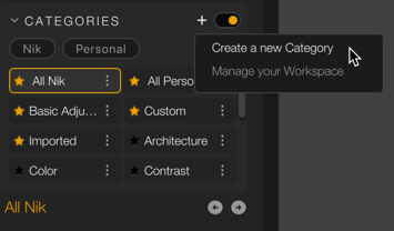
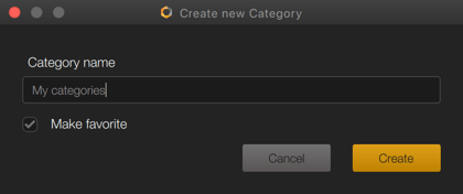
You can create your own categories, called Personal:
- Click on the “+” button.
- From the context menu, select Create category.
- In the dialog box, enter the category name.
- If desired, check the Mark as favorite box (the star in front of the name will be activated).
- Click on Create.
- The category appears in the Categories section, and you can filter its display using the Personal button.
Manage the presets
Nik Collection lets you save corrections and renderings in the form of presets, meaning you can easily reuse them on other images and share them with other users.
On this page you will find common features to creating, managing, and sharing presets, except for the following plugins:
- Nik Dfine, which lets you save noise reduction profiles, not presets. See the appropriate chapter for more details.
- Nik Presharpener.
Creating a custom preset
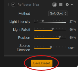
You can create and save a custom preset at any point in the workflow:
- Apply an existing filter or preset, and make the desired corrections with the tools in the right-hand panel.
- At the very bottom of the right-hand panel, click on the Save preset button. Alternatively, go to the 3-dash button in the Presets section (left panel) and select Save Preset from the context menu.
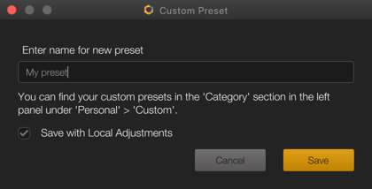
- In the Custom Preset dialog box, enter a name that explicitly describes your filter, making it easier to find. Note that the dialog box informs you that your preset will be saved in the Custom category.
- If you wish to save the local adjustments, make sure that the checkbox is ticked (it is checked by default).
- Validate by clicking on Save.
By default, custom presets are saved in the Custom category (Personal categories).
Copying a preset to another category does not remove it from the original category.
Managing custom presets
You can make the most of your customized presets with the following functions:
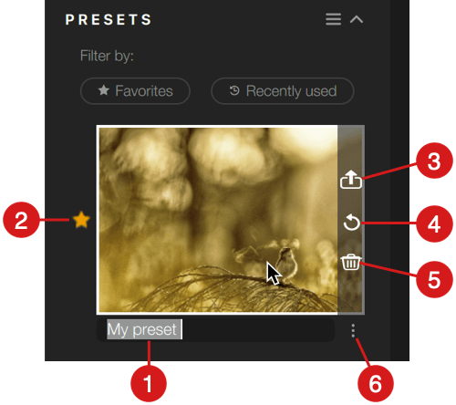
- Rename: click on the preset name below the thumbnail to activate the input field. After entering the new name, confirm with Enter.
- Mark as favorite: click on the star to the left of the preset (the star turns yellow). Click again to cancel (star reverts to grey).
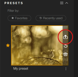
- Export: hover over the preset to display the buttons on the right in the thumbnail. By clicking on the top button, you’ll be able to export the preset, with the aim of sharing it. A system dialog box allows you to choose the save location, before clicking Open.
- Update: after modifying or adding corrections to a custom preset, hover over the thumbnail to display the buttons on the right. Click on the curved arrow to update the preset with the modified or added corrections.
- Delete: hover over the preset to display the buttons to the right of the thumbnail. Click on the trash can to delete it, and a dialog box will ask you to confirm (you can disable the warning by checking Don’t show again).
- Add to category: see below.
Add presets to other categories
- By default, customized presets are saved in the Custom category (Personal categories). From here, however, you can assign them to another personal category, whether existing or not:
- Click on the Custom category.
- In the list of preset thumbnails, identify the desired preset.
- Click on the 3-dot button to the right of the thumbnail (opposite the preset name).
- In the context menu, go to Add to category and then, in the submenu, select the destination category.
- To create a category on the fly, click on Create then, in the dialog box, enter the name and confirm by clicking on Create. The preset will be automatically assigned to it.
- If you already have a long list of categories, enter the name in the field to facilitate the search.
Sharing custom presets
Custom presets are exported as instructions in simple text files in “.json” format. Weighing just a few Kb, they can be easily shared as attachments in your e-mail or messaging services. The file name is that of the preset.
Exporting custom presets
There are two ways of exporting custom presets, whether in the All, Custom, Imported or any other personal category:
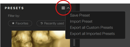
- Export preset by preset, using the export button that appears when hovering over a thumbnail with the mouse.
- Export all custom presets or re-export all imported presets:
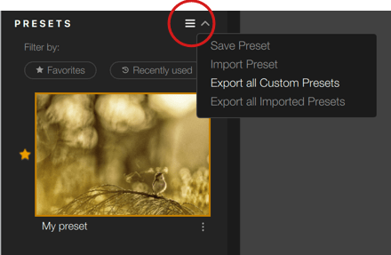
- in the Presets section of the left-hand panel, click on the 3-dash button
from the pop-up menu, select Export all custom presets or Export all imported presets, - a system dialog allows you to choose the save location and execute the export.
- in the Presets section of the left-hand panel, click on the 3-dash button
Import custom presets
To import custom presets, you need to go through the Custom, All or Personal categories, rather than the Imported category:
- In the left-hand panel, click on the 3-dash button in the Presets section, and select Import preset from the context menu.
- A system dialog box opens:
- locate the presets to be imported,
- select the presets to be imported,
- click on Open.
- Imported presets are displayed in the Imported category.
Imported presets can be renamed, marked as favorites, exported and deleted, in the same way as custom presets. You can also add them to other categories, in the same way as custom presets (see Adding presets to other categories, earlier in this page).
However, it is not possible to update settings: to do this, apply the imported preset, modify the settings in the right-hand panel, then create a custom preset.
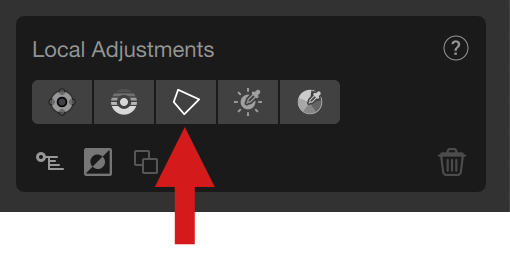
Local adjustments
Overview
Advanced and Classic modes
From Nik Collection 7 onwards, the advanced local adjustments are used by default. Their architecture, possibilities and algorithms are different than the legacy local adjustments, and, at the end, they offer more possibilities, power and flexibility.
However, the classic (legacy) local adjustments, which only include control points and lines, as you can find them in the previous versions (up to and including Nik Collection 6), are still available in the following scenarios:
- An image edited with the non destructive workflow involving the legacy local adjustments.
- An image edited with the smart object workflow in Photoshop and involving the legacy local adjustments.
- Presets which include the legacy local adjustments.
In that case, you will have the choice of keeping your edits as they are, or modify them, to convert them into the advanced mode.
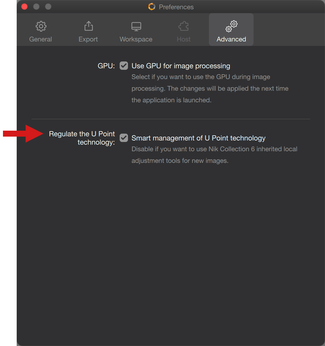
If you need to switch from advanced to classic modes, and the other way around, go into the Preferences, Advanced tab, and check Smart management of U Point technology. A Mode section will show up in the right panel, below the Histogram section, where you will be able to toggle the Classic and Advanced modes.
The local adjustments in Nik Collection consist of 4 tools:
- Control Points.
- Control Lines.
- Control Polygons.
- Luminosity Mask.
They allow you to make corrections to portions of an image, intuitively and with great precision. Here is how they work:
- You can move them.
- You can add as many as you like.
- You can select and link them to apply the same adjustments.
- You can invert them.
- You can add a neutral local adjustment to protect an element from the effect of another local adjustment.
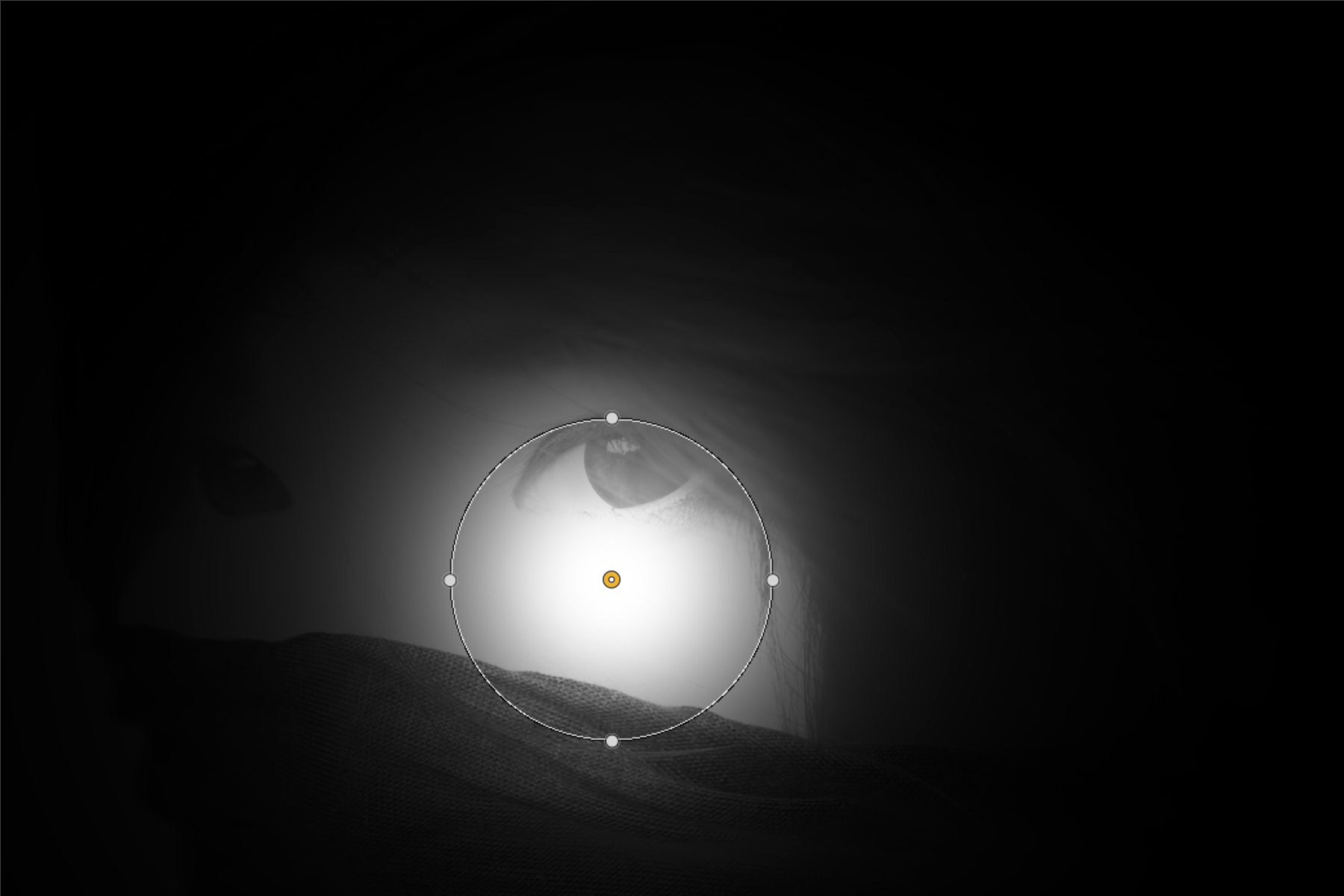
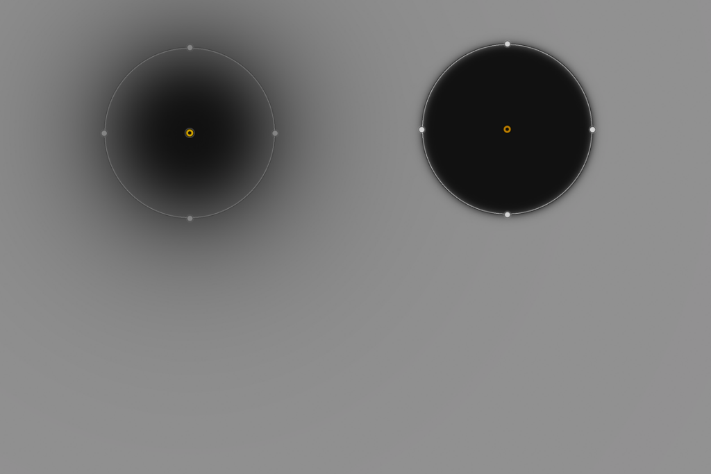
- You can view them with a black and white mask. White indicates where the correction is applied at 100%, black indicates where the correction is not applied (0%), and gray levels indicate the intermediary correction values (average gray = ~ 50% of the correction, etc.).
- You can rename them.
- You can include them in a preset.
- You can delete them individually or in batches.
This section looks at general use of the user interface as well as the Local adjustments features found across Nik Collection. Specific correction, functions and tools are discussed in the chapter of each Nik Collection plugin.
Control points
Description
Control points are based on U Point technology (developed by Nik Software and acquired by DxO Labs in 2017) which makes it possible to make a precise selection without needing a mask or any other complex tools. U Point is simply an abbreviation of “you point.” Each of the Nik Collection plug-ins includes control points.
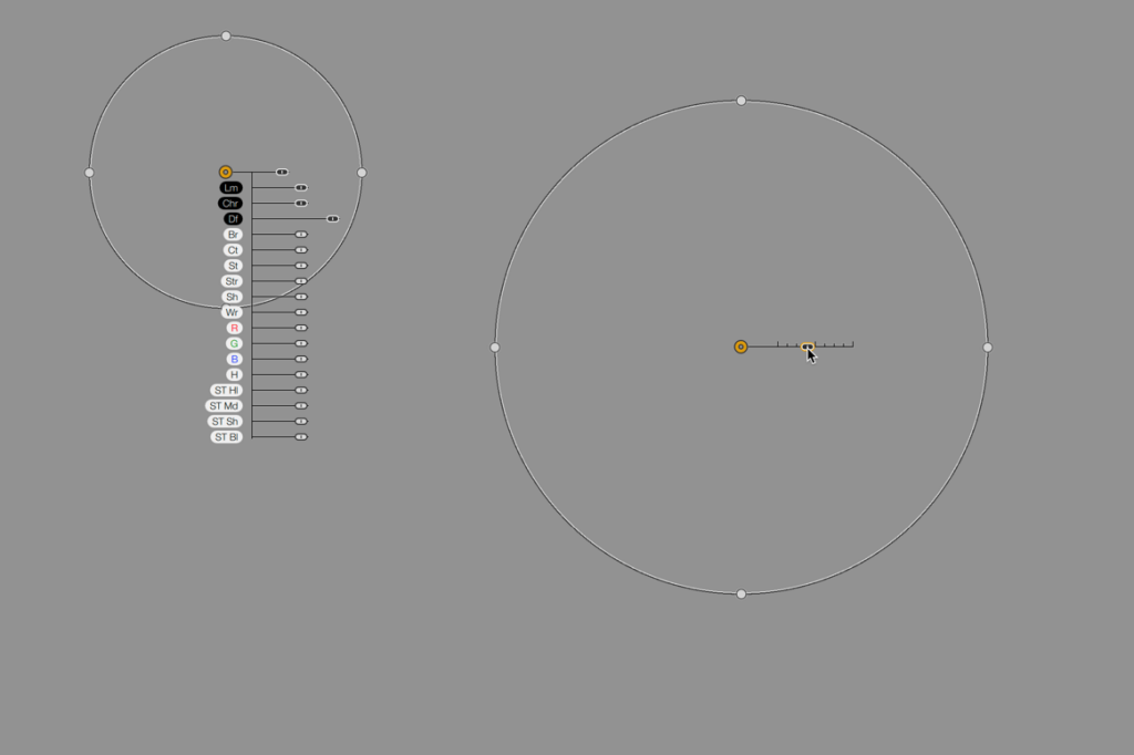
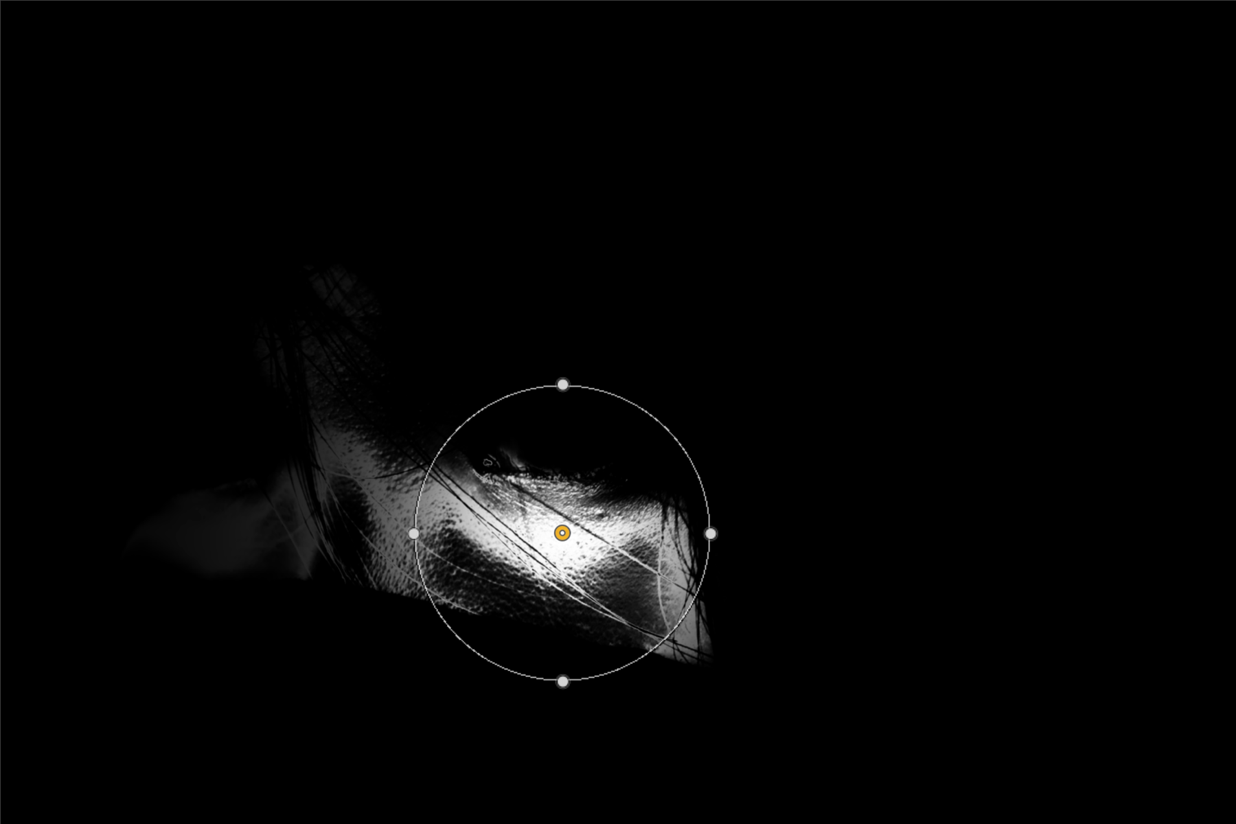
A control point selects by measuring a number of parameters, specifically – the brightness and color of the pixels to which it is applied. U Point technology then automatically selects the elements and areas of the image that represent similar features to where the control point is affixed, thus creating a selection mask whose size is defined by a slider or by dragging the circle/ellipse with the mouse.
If two or more control points are affixed on top of each other, the masks will overlap:
- If the control points are not linked, you can apply different corrections using the sliders (the masks overlap).
- If the control points are linked, the corrections made on one will be the same on the others (the masks are merged).
A color picker is also available to measure brightness and color offset of the active control point.
Using control points
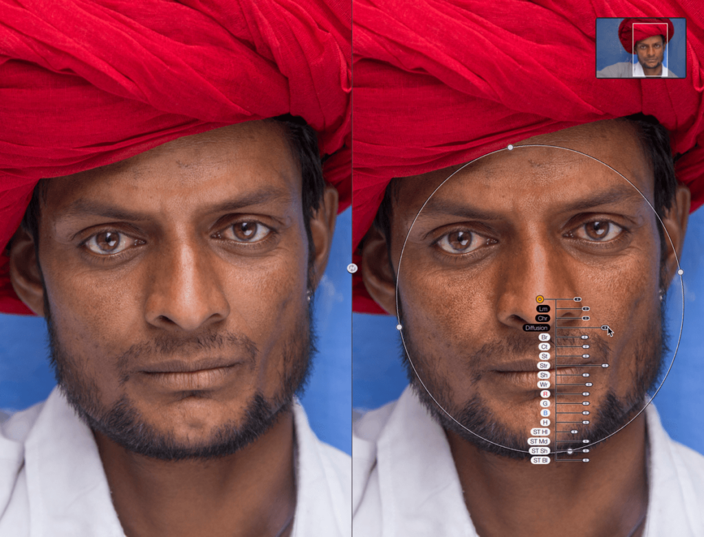
- In the right panel, click the Add Control Point button.
- When you roll over the image, the mouse turns into a cross (+).
- Click in the image to place the control point.
- The control point appears as a yellow (active control point) or white (inactive control point) dot.
- When active, a control point has a size slider, a set of sliders (opacity, luminance, chrominance and diffusion, common to all plugins), as well as sliders specific to the plugin used (you can hide sliders – see the Managing local adjustments section thereafter).
- When the control point is inactive, you can mouse hover it to see the slider and the radius (to adjust them, you must first activate the control point by clicking on it).
- Whether it is active or inactive, you can move any control point by dragging it with your mouse.
- If you need to do an offset brightness/color measurement, for a more precise active mask, move the color picker wherever you want, even out of the circular area. The brightness and color measurements are taken wherever you place the color picker (no need to click).
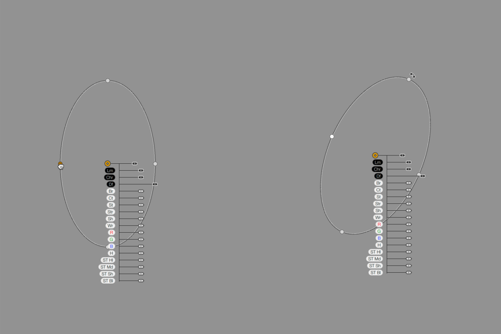
- You can adjust the size (or diameter) of the circular area with the slider or with the mouse.
- You can change the shape of the circular area by dragging the 4 handles. Each handle acts with the opposite handle, to give a more oval or elliptical shape.
- You can rotate the control area: if you put the mouse pointer close to one of the 4 handles, a curved double arrow appears: grab the relevant handle and rotate the whole circle/ellipse.
- You can add as many control points as you want.
- To remove a control point, click on it to activate it and press the Delete key on your keyboard. A dialog box will prompt you to confirm (check the Don’t show again box to stop displaying the dialog box).
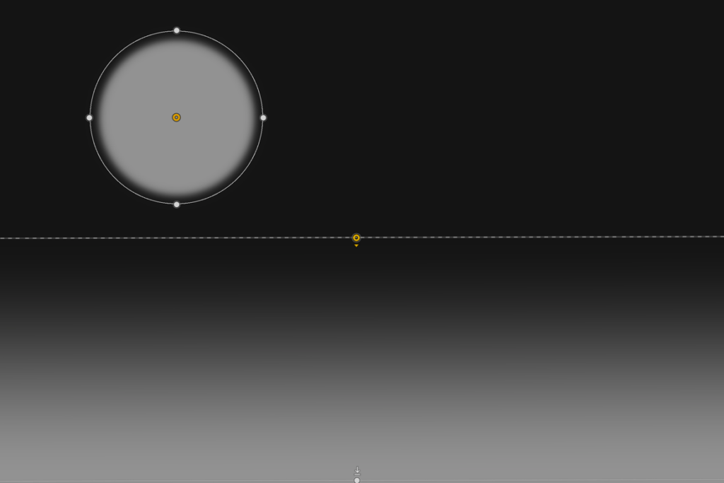
Control lines
Description
Control lines are also based on U Point technology. They can be used as graduated filters to correct larger parts of the image. The operation of a control line is the same as a control point, where the central point detects the brightness and color of the overflown pixels. You can also use the color picker to modify the measurement.
Using control lines
- In the right panel, click the add control line button.
- When you roll over the image, the mouse turns into a cross (+).
- Click on the image where you want to place the control line. Drag the mouse to adjust the size of the control line.
- A control line is composed of the following elements:
- a yellow dot (active control line) or white dot (inactive control line) accompanied by a small arrow of the same color, indicating the direction of the gradient in the control area,
- a dotted line across the width of the image (or across the height, or the width and the height, depending on the control line orientation), passing through the color dot. This indicates the area where the correction will be fullest. The dotted line can be moved relative to the other line by grabbing it with the mouse,
- a second line (white with thin black lines) across the entire width of the image, with a white handle. By grabbing this handle, you can stretch or reduce the gradient between the two lines, or rotate the whole thing. The arrow close to the handle indicates the direction of the control line, thus the direction of the effect applied,
- a color picker that measures brightness and color, if you need to do offset measurements.
- When active, a control line has a set of sliders (opacity, luminance and chrominance, common to all plugins), as well as sliders specific to the plugin used (you can hide sliders – see the Managing local adjustments section thereafter).
- When the control line is inactive, you can hover the mouse over it to view the two lines (but to adjust them, you must first activate the dot by clicking on it).
- Whether active or inactive, you can move a control line with the mouse by left-click dragging with the mouse.
- The second line can be located outside the photo and even outside the frame of the working area.
- You can add as many control lines as you want.
- To remove a control line, click on the dot to activate it and press the Delete key on your keyboard. A dialog box will prompt you to confirm (check the Don’t show again box to stop displaying the dialog box).
Control Polygons
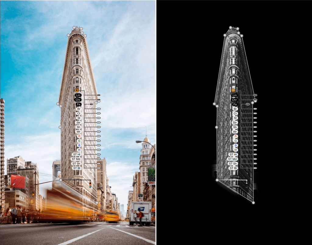
Description
The control polygons are based on the U Point technology and principles too, but offer to the user a different way to achieve local selection. As the control point and line, the main dot (the first when you click in the image) detects the brightness and color of the overflown pixels. You can also use the color picker to modify the measurement.
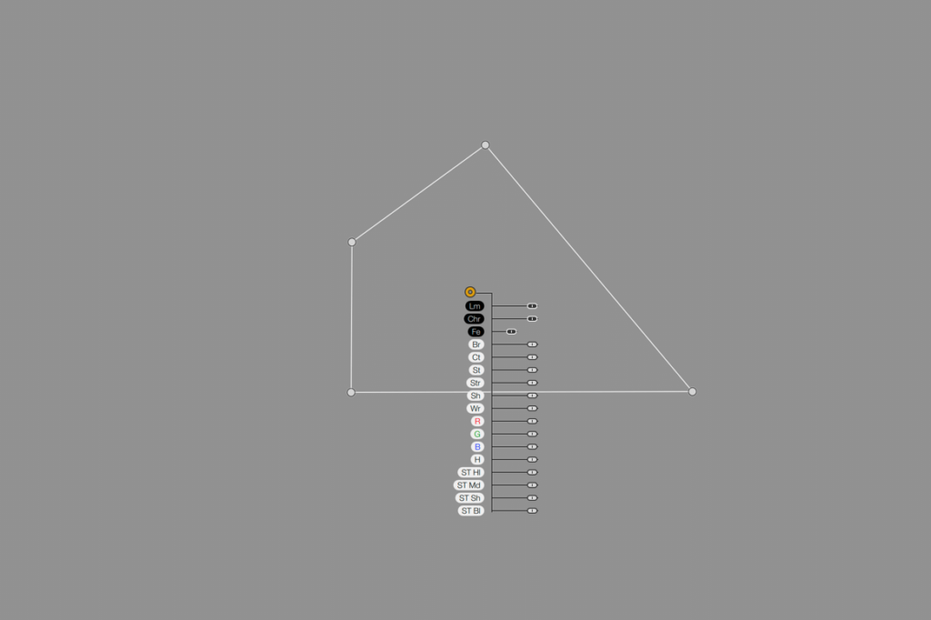
Using control polygons
- In the right panel, click the add control polygon button.
- When you roll over the image, the mouse turns into a cross (+).
- To select any object, element or area, click to start, then move the mouse, click elsewhere, and so on. To close the polygon, you need to click on the very first handle.
- In the same polygon, you can add as many handles and lines as you want.
- Each handle is separated by a straight line. You can change the position and the length of each individual line by dragging the relevant handle. You can’t overlap lines (overlapped lines turn to red to warn you).
- When active, a control polygon has a set of sliders (opacity, luminance, chrominance and feathering, common to all plugins), as well as sliders specific to the plugin used (you can hide sliders – see the Managing local adjustments section thereafter).
- If you need to do an offset brightness/color measurement, for a more precise active mask, move the color picker wherever you want, even out of the circular area. The brightness and color measurements are taken wherever you place the color picker (no need to click).
- Whether active or inactive, you can move a control polygon with the mouse by left-click dragging with the mouse.
- To remove a control polygon, click on the dot to activate it and press the Delete key on your keyboard. A dialog box will prompt you to confirm (check the Don’t show again box to stop displaying the dialog box).
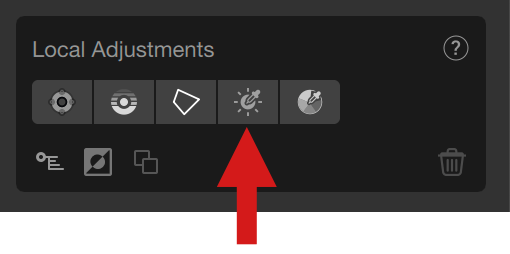
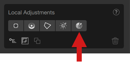
Luminosity Mask
The Luminosity Mask allows you to correct an image based on a brightness range you can adjust with a high precision, including the transition levels (fall-off).
To activate the Luminosity Mask tool, click on the fourth button in the Local Settings section. The mouse pointer changes to a cross, allowing you to select a luminosity (brightness) range in the image by clicking. The trapezoid, in the Mask Options section (below the Local settings list) will then display the luminosity range.
Using the luminosity masks
- In the right panel, click the add luminosity mask button.
- When you roll over the image, the mouse turns into a cross (+).
- Click in the image to select a brightness level. You can move the dot wherever you want.
- When active, a luminosity mask has only one slider (opacity, common to all plugins), there is NO Luminance, Chrominance and Diffusion/Feathering sliders.
- There is NO color picker to perform offset measurements.
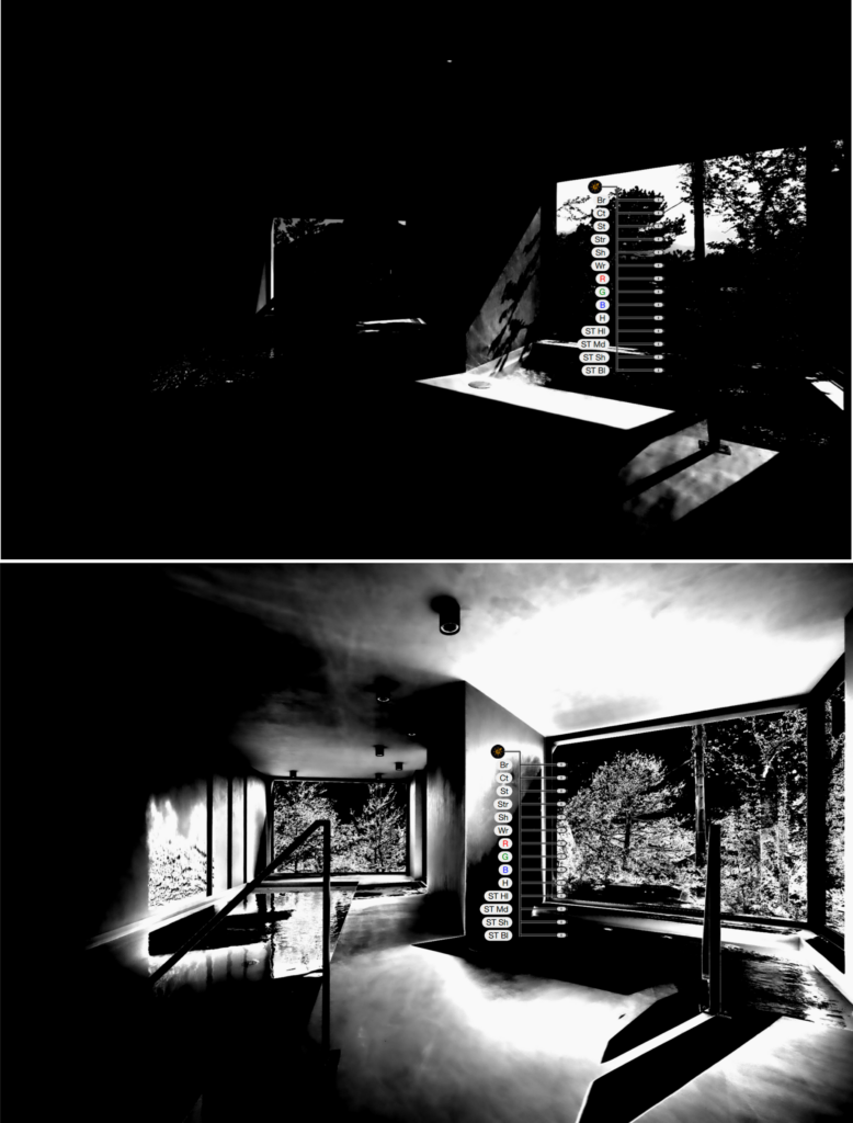
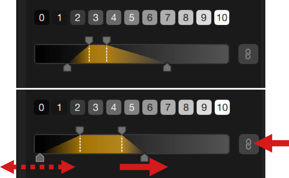
The Luminosity Mask tool consists of the following elements:
- 11 luminosity zones: the scale from 0 to 10 allows you to select a brightness range easily, by clicking on the tiles, one by one or more (hold the Shift key) from the darkest (0) to the brightest (10), the middle values being at 5.
- Trapezoid: in addition to its role of indicating the selected brightness range and the fall-off, you can adjust it by moving it in the scale. You can refine the luminosity mask as follows:
- The scale is a linear representation of the image levels of brightness, from the darkest blacks (left tip) to the brightest whites (right tip).
- The handles above the trapezoid, as well as the associated dotted lines, represent the lower (dark tones) and upper (light tones) limits of the selected luminosity range. You can extend or reduce the luminosity range by moving the handles.
- The handles below the trapezoid indicate the limits in the fall-off (transition) of luminosity levels, between the selected range and the rest of the image. The further you move these handles from the dotted lines, the more you extend the fall-off, the more you dilute the luminosity levels, and the closer you move the handles, the more you reduce the transition levels and the more abrupt the fall-off will be.
- By acting on the position and extent of the trapezoid, as well as the extent of the fall-off, you will arrive at an extremely precise selection of the range to be corrected. In addition, the Opacity slider, in the panel or attached to the dot in the image, is set to 100 by default, allows you to reduce the intensity of the Color Mask and the local adjustments associated with it.
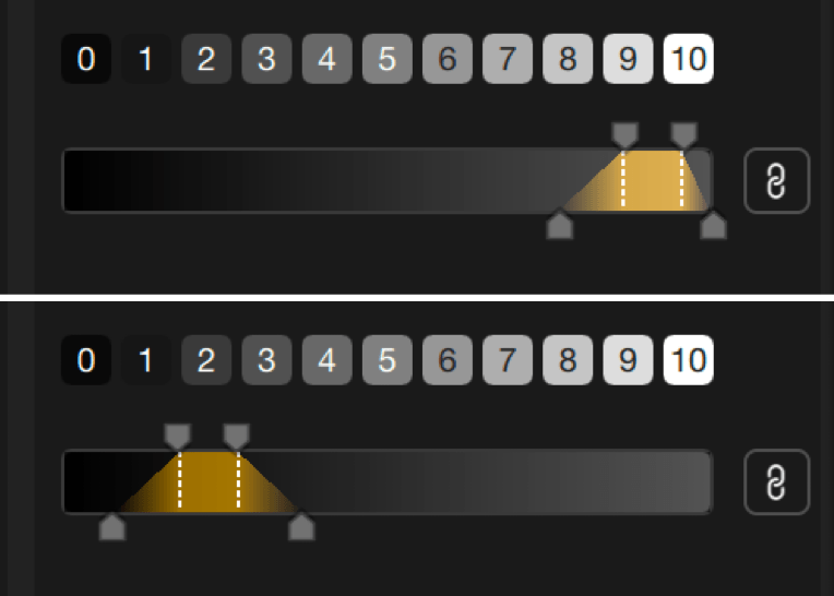
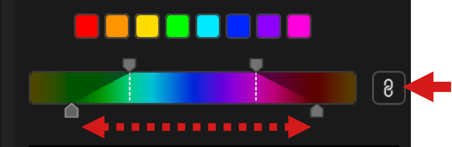
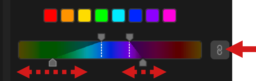
- The chaining button, active by default:
- Active (black button): upper or lower handles are linked and can be moved symmetrically. By moving the upper handles, you extend or reduce the luminosity range equally on both left and right, and the fall-off remains unchanged. By moving the lower handles, the fall-off will adjust equally left and right, and the upper handles will not move.
- Inactive (gray button): upper or lower handles are no longer linked, and can be moved differently left and right. If you move an upper handle, the other will not move, and the fall-off will remain the same on the side you are adjusting. If you grasp one of the lower handles, you will adjust the fall-off on that side only, and the corresponding upper handle will not move.
Color Mask
The Color Mask tool allows you to make local corrections based on a particular color or range of hues, taking into account transitions with other colors and hues in the image.
To activate the Color Mask tool, click on the fifth button in the Local Settings section. The mouse pointer changes to a cross, allowing you to select a color or color range in the image by clicking. The trapezoid, in the Mask Options section (below the Local settings list), will then display the active color or color range, and indicate the active color channel with a white dot.
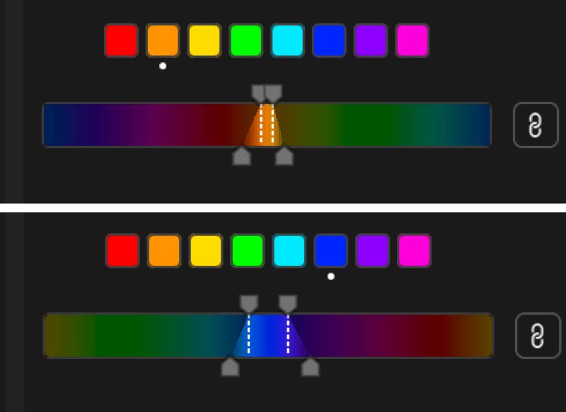
The Color Mask tool consists of the following elements:
- Color channels (8), on which you can also click to activate the corresponding color range (from left to right):
- Red.
- Orange.
- Yellow.
- Green.
- Cyan.
- Blue.
- Magenta.
- Pink.
- The color scale, which lets you adjust color range and transitions:
- The scale, a linear representation of the color wheel.
- The trapezoid, which indicates the selected color range and transitions.
- Upper handles, which extend or restrict the selected color range, whose ends are marked by white dotted lines.
- Lower handles, which control the (fall-off) transition between the selected color range and other colors, whether adjacent (closer or further apart in hue) or distant (different in hue).
- The closer the lower handles are to the white dotted lines, the steeper the fall-off.
- By moving the lower handles further away, transitions are more gradual and can encompass other colors in the image (you can use the display mask to visualize precisely which parts of the image will be affected by your settings).
- By acting on the position and extent of the trapezoid, as well as the extent of the fall-off, you will arrive at an extremely precise selection of the color range to be corrected. In addition, the Opacity slider, in the panel or attached to the dot in the image, is set to 100 by default, allows you to reduce the intensity of the Color Mask and the local adjustments associated with it.
- The chaining button, active by default:
- Active (black button): upper or lower handles are linked and can be moved symmetrically. By moving the upper handles, you extend or reduce the color range equally on both left and right, and the fall-off remains unchanged. By moving the lower handles, the fall-off will adjust equally left and right, and the upper handles will not move.
- Inactive (gray button): upper or lower handles are no longer linked, and can be moved differently left and right. If you move an upper handle, the other will not move, and the fall-off will remain the same on the side you are adjusting. If you grasp one of the lower handles, you will adjust the fall-off on that side only, and the corresponding upper handle will not move.
Linking the local adjustment tools
If the possibility to group/ungroup the different local adjustment tools through the right panel is gone (from Nik Collection 7, in May 2024), you still have the possibility to link multiple local tools and adjustments:
- Make sure that none of the local adjustment tools button is active in the panel.
- In the image, click close to the control point, control line, control polygon or luminosity mask dot that you will be using as the main setting and then, holding the left mouse button, drag a rectangle to encompass all the other dots you want to link (the rectangle will have white edges and a white translucent fill).
- Release the mouse button: all included tools are linked and active (and yellow):
- only the sliders of the control point or the control line where you started to draw the selection rectangle are visible,
- these sliders will affect all the tools in the same way,
- the size of the area of influence remains independent and changeable, from one tool to another,
- the tools dots keep their appearance.
- Another way to link multiple local adjustment tools is to hold the Cmd (Mac) or Ctrl key (PC) and click on the dots.
- To cancel the linkage and regain the dependency of each control point and/or control line, click anywhere in the image.
- The linking technique can also be used to remove several local adjustment dots at once (press the Back or Delete key).
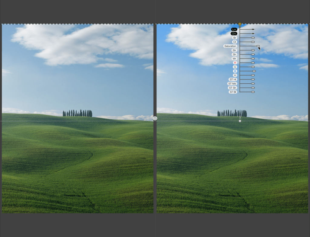
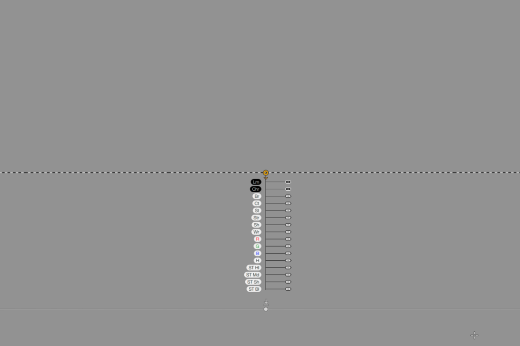
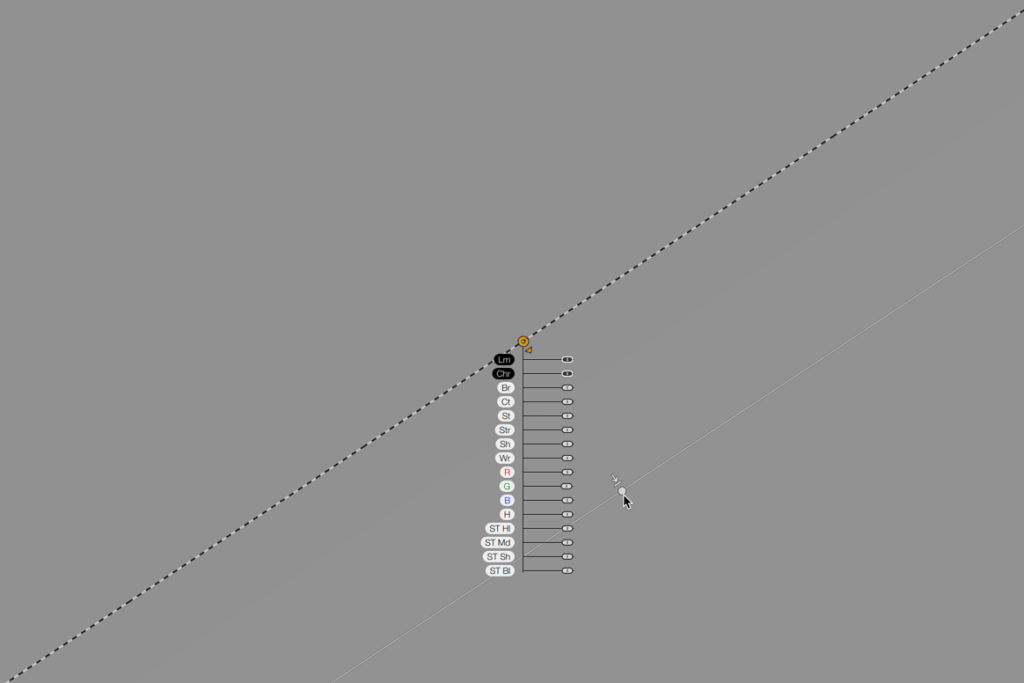
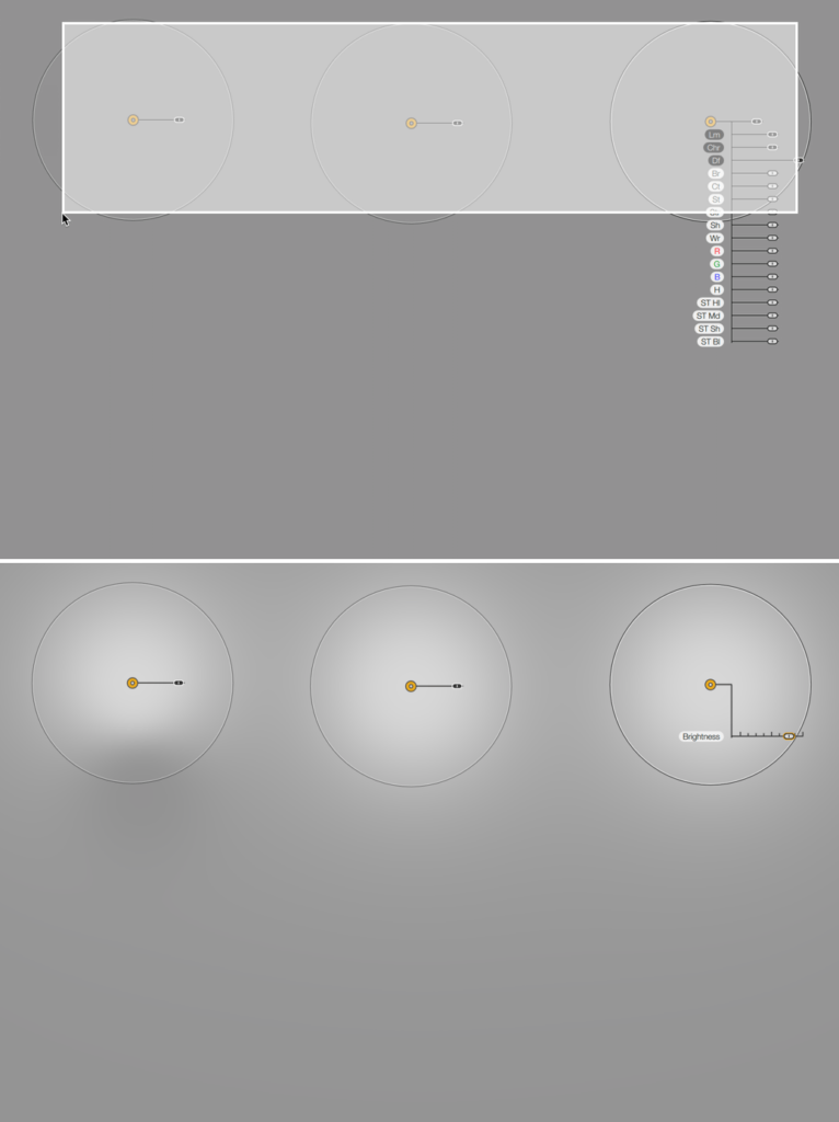
Common control sliders
Overview
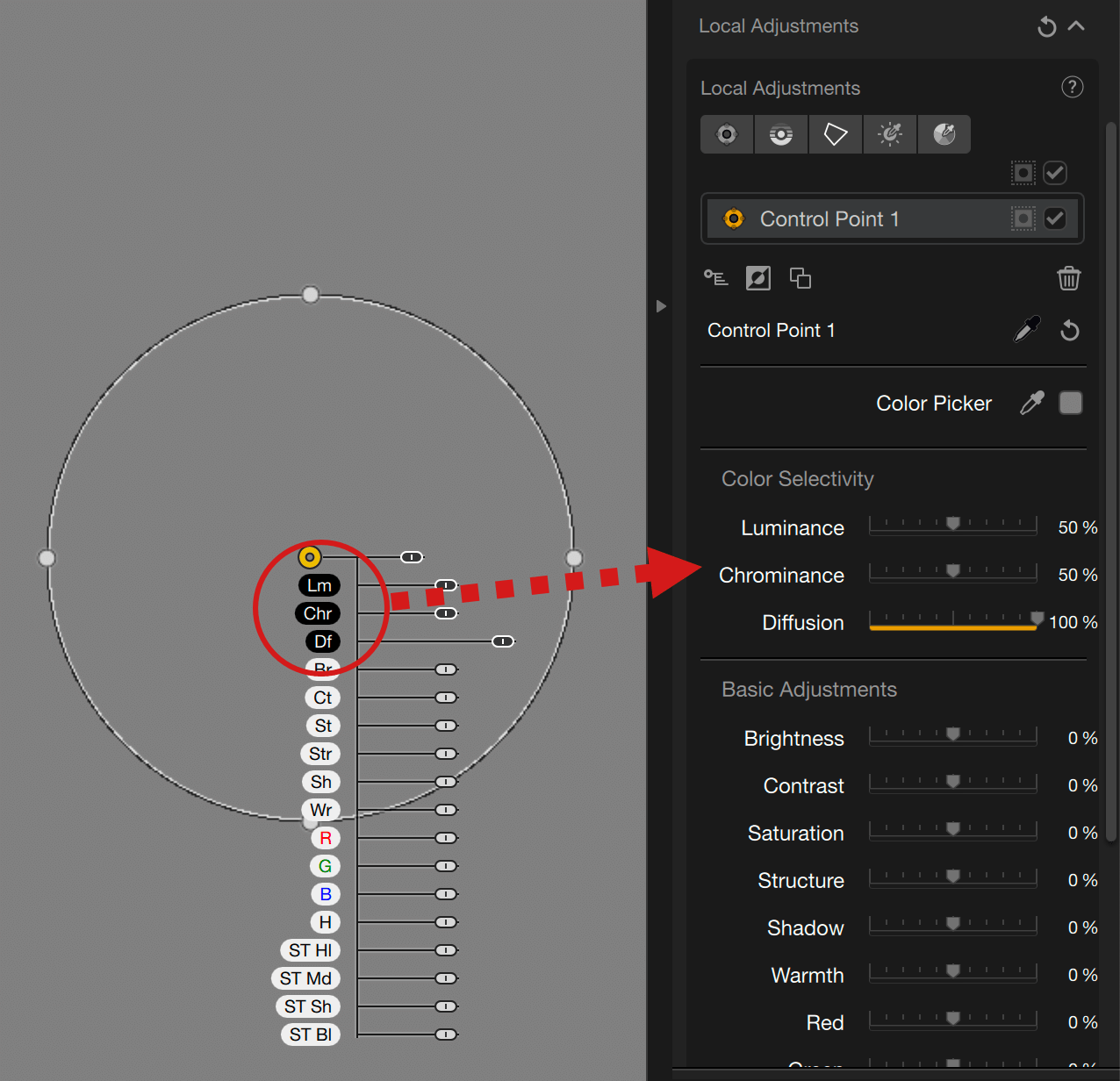
Each Nik Collection plugin has common sliders as well as other sliders that are unique to it, and you will find them in two locations:
- Directly attached to the control point, control line, control polygon or luminosity mask dot.
- In the right panel, when there is at least one local adjustment affixed to the image.
- The luminosity mask has only an opacity slider attached to it.
When moving a slider attached to a local adjustment tool dot, the equivalent slider in the right panel will also move, and vice versa.
Sliders attached to a local adjustment dot are positioned below by default, but they adapt to the image, so will not be masked by elements of the interface. For example, if you place a control point or line at the bottom of the image, the sliders will be positioned above the edge. The same applies with the left and right edges; sliders will be positioned on the right or on the left respectively.
Sliders also have the following features (except for the luminosity mask):
- White handles and labels correspond to the tools of each plugin.
- Black handles and labels correspond to common tools:
- Size (control points only).
- Lm for Luminance (except luminosity mask).
- Chr for Chrominance (except luminosity mask).
- Df for Diffusion (control points only).
- Fe for Feathering (control polygon only).
- Op for Opacity (luminosity mask only).
The labels are an abbreviation of the corresponding tool; the names are displayed in full when you mouse-over them.
Selective Color Sliders

Selective color sliders let you extend or reduce the selectivity range of the color covered by a control point, line or polygon. This way, you will be able to cover hue and brightness level changes in your correction (e.g. to take into account variations in skin hues or blue sky):
- Lm (Luminance): Determines the brightness range of the color (defaults to 50%).
- Chr (Chrominance): Determines the extent of color hue variations (defaults to 50%).
The effect of the selective color sliders being subtle, use the black/white mask for the control points, lines and polygons (see Managing local adjustments section, afterwards).
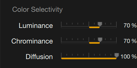
Diffusion/Feathering slider
The Diffusion (control points)/Feathering (control polygon) slider lets you adjust the hardness of the boundaries of the selected area:
- 100% by default, the edges of the correction area are fully diffused.
- Move the slider to the left for a more pronounced edge-correction.
The hardness of the edges also varies with the size of the area, the smaller it is, the harder the edges will be.
The effect of the Diffusion/Feathering slider is also subtle, use the black/white mask for the control points, lines and polygons (see Managing local adjustments section, afterwards).
Managing the local adjustments
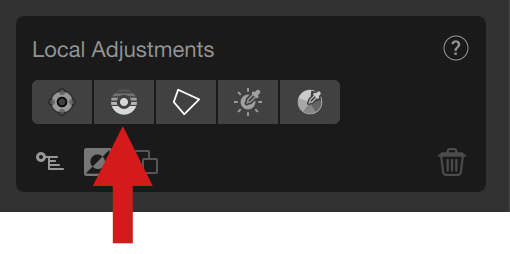
Local adjustments section
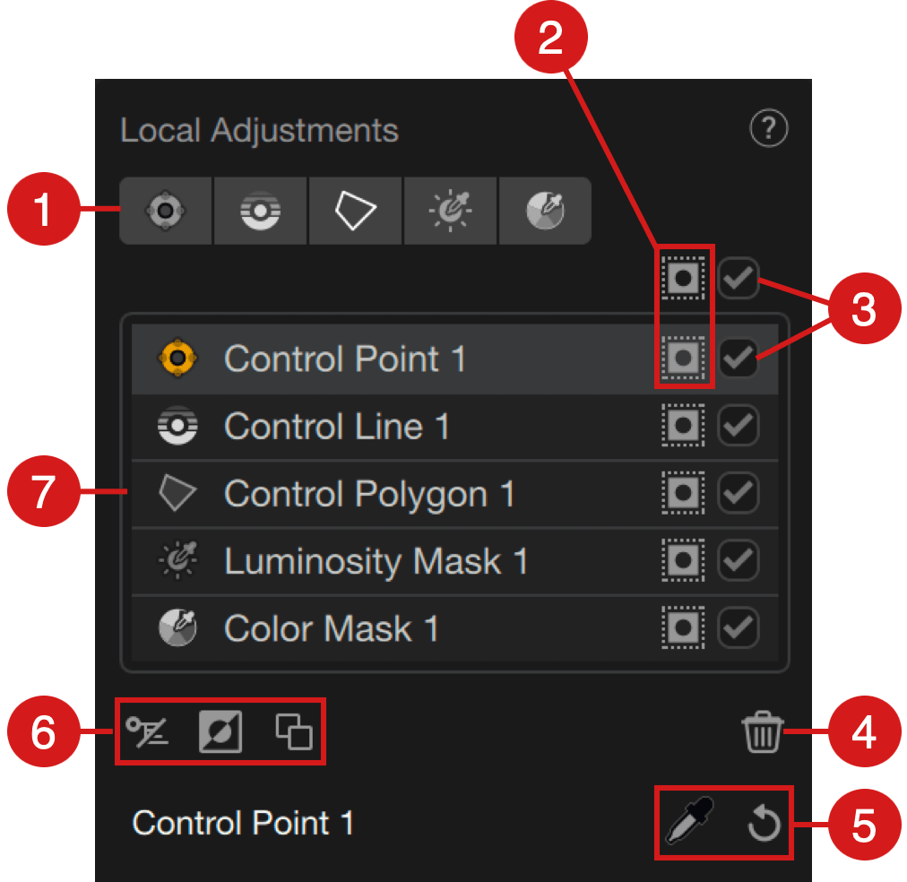
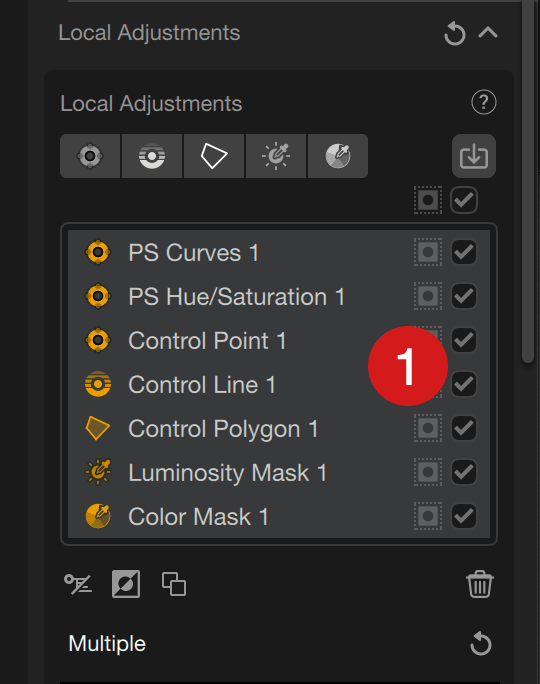
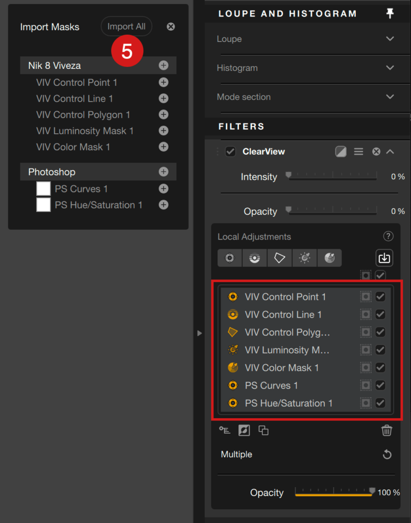
The local adjustments section, located in the right panel, lets you manage the different local tools (control point, control line, control polygon and luminosity mask) applied to the image, shown as a list. Active tools are indicated in yellow.
- Add buttons: these buttons create a control point, control line, control polygon or luminosity mask to apply local settings.
- Show/Hide mask :
- the button above the list lets you show/hide black/white masks of all control points and control lines,
- the button in the list lets you show/hide the black/white mask of the relevant control point or control line individually.
- Show/Hide Effect:
- the checkbox above the checklist deactivates or re-activates all control points and control lines applied to the image, as well as the related corrections and adjustments,
- the checkbox in the list disables or individually reactivates the control point or control line, as well as the related corrections and adjustments.
- Delete: Click on the trash to clear the currently selected control points/lines.
- From left to right:
- Color picker: the color picker allows you to do offset brightness/color measurements to refine the corrections. It is not available with the luminosity masks, and when multiple local adjustment tools are linked. To use it with a control point, control line or control polygon, you need to click on the icon. An active color picker is indicated by a small orange dot next to it in the right panel*.
- Reset: Resets all sliders and associated settings of the selected local adjustments in the list to zero.
- From left to right:
- Show or hide local settings: lets you show or hide the sliders at the local adjustment dots, in the picture.
- Invert: Reverses the mask of selected control points or control lines.
- Duplicate: By clicking this button, you duplicate the current selected local adjustment tool. You can also duplicate a tool by clicking on it while pressing Alt (PC) or Option (Mac), then dragging the mouse to position the duplicate.
- List of local adjustment tools: the active tools indicated by a yellow icon and white name are selected and therefore modifiable, white indicated tools are inactive and, therefore, unchangeable. When you link many local adjustment tools, their relevant icons in the list are yellow (and active).
*If you use the color picker for an offset measurement, you can go back to the measurement made by the local adjustment dot by moving the picker next to the dot.
Neutral local adjustments
Another functionality provided by the local adjustment tools is the so-called “neutral” control point, control line, control polygon or luminosity mask. It acts as a protection.
Indeed, if you apply a local adjustment to selectively correct an image element and that, despite your efforts, the correction affects another element or other image portion that you do not wish to alter, putting a neutral local adjustment tool on this element will prevent the corrections of the other tool being applied.
Neutral local adjustment tools can be selected and used as follows:
- Analog Efex, Dfine, Color Efex, HDR Efex, Presharpener and Silver Efex:
- In the right panel, press the Alt (PC) or Option (Mac) key and click on any Add Control Point/Line/Polygon or Luminosity Mask button. In that case, the cross (+) bears a little minus sign (-).
- To apply the neutral tool, click on any part of the image you want to protect, while keeping the Alt/Option key pressed.
- All settings and relevant sliders are set to their default and/or 0 value, meaning that no correction is applied.
- HDR Efex, Sharpener Output and Viveza:
- In the right panel, click on any Add Control Point/Line/Polygon or Luminosity Mask button. There is no minus (-) indication.
- To apply the neutral tool, click on any part of the image you want to protect.
- All settings and relevant sliders are set to their default and/or 0 value, meaning that no correction is applied.
Here too, the use of black and white masks will help you to verify the action and interaction of the local adjustment tools, whether they are normal or neutral.
The normal and neutral local adjustment tools can be overlapped, meaning that you can put, for example, a neutral control point or whatever within the range of another control point (or whatever).
Rename the local adjustment tools and masks
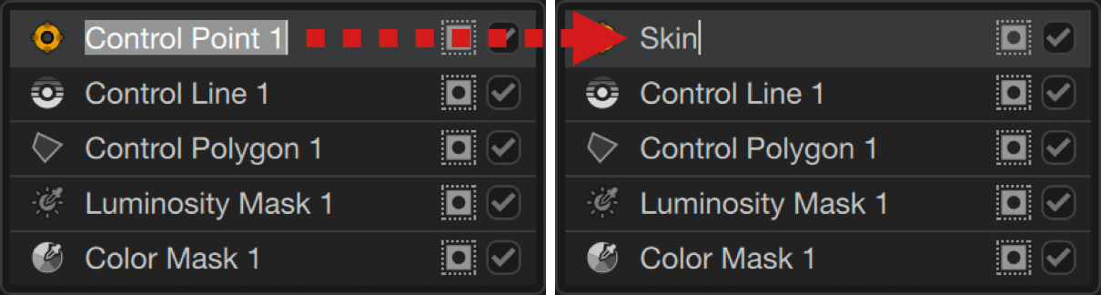
You can rename your local adjustment masks, which can quickly become numerous, to help you manage them:
- In the list, double-click on any name (the tool and associated mask must be inactive when you want to rename it).
- The name is highlighted: enter the new name directly. The old name is deleted as soon as you start typing.
- If you just want to change the name, move the flashing input cursor using the left and right arrows on your keyboard.
- Confirm with the Enter key.
Renaming does not change the order in the list, and there is no automatic alphabetical ordering. Nor can you change the order by drag and drop.
Sharing local adjusment masks
In addition to use Photoshop masks (see the Workflow with Adobe Photoshop page), you can share any of the local adjustment masks between the Nik Collection plugins:
- In any of the Nik Collection plugins, create local adjustment masks, including importing Photoshop masks.
- Switch to another Nik Collection plugin using the switch menu in the upper right corner.
- In the new plugin, add any tool using local adjustments.
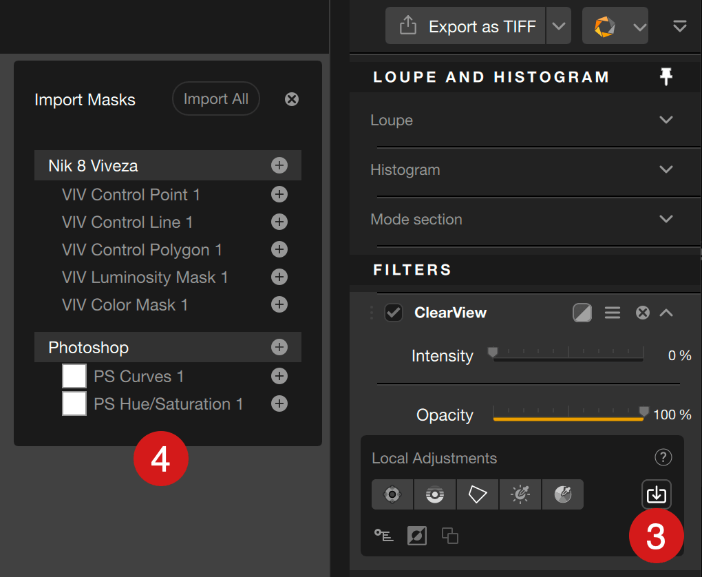
- In the local adjustments panel, click on the Import Masks button.
- A floating window shows the list of all masks* from the previous plugin, including Photoshop masks if you have imported them.
- If there are multiple masks, click the + button to add the desired mask(s).
- To add all masks in one go, click the + button on the line sporting the plugin name, or click on Import all.
*All imported masks retain their name, whether it’s the original default name or a customized one.
Shortcuts
| Description | Mac | PC |
| Copy Control Point | Cmd+D | Ctrl+D |
| Group Control Points (Classic Mode) | Cmd+G | Ctrl+G |
| Ungroup Control Points (Classic Mode) | Cmd+Shift+G | Ctrl+Shift+G |
| Select All Control Points | Cmd+A | Ctrl+A |
| Enable Adding Control Points | Cmd+Shift+A | Ctrl+Shift+A |
| Enable Adding Control Lines | Cmd+L | Ctrl+L |
| Invert Local Adjasment | Cmd+I | Ctrl+I |
| Toggle Antenna Visibility | Shift+E | Shift+E |
| Toggle Color Picker | Shift+R | Shift+R |
| Open File | Cmd+O | Ctrl+O |
| Save | Cmd+S | Ctrl+S |
| Save As | Cmd+Shift+S | Ctrl+Shift+S |
| Undo | Cmd+Z | Ctrl+Z |
| Redo | Cmd+Y | Ctrl+Y |
| Quit | Cmd+Q | Ctrl+Q |
| Help | – | F1 |
| Next Background | B | B |
| Toggle Panels | Tab | Tab |
| Toggle Sliders | E | E |
| Delete Control Point | Delete | Delete |
| Backspace | Delete | Backspace |
| Toggle Left Panel | L | L |
| Toggle Right Panel | R | R |
| Zoom In | Cmd+Plus | Ctrl+Plus |
| Zoom Out | Cmd+Minus | Ctrl+Minus |
| Zoom To Fit | Cmd+0 | Ctrl+0 |
| Zoom To Original | Cmd+1 | Ctrl+1 |
| Compare With Original | P | P |
| Toggle Maximize Screen Mode | F | F |
| Toggle Mask Mode | M | M |
| Close DxO Hub | Esc | Esc |
| Vary Button In Analog Efex (Full Level) | Shift+Cmd+Alt+Click | Ctrl+Shift+Alt+Click |
| Vary Button In Analog Efex (Strong Level) | Shift+Click | Shift+Click |
| Vary Button In Analog Efex (Medium Level) | Alt+Click | Alt+Click |
| Slider +1 Value | Right | Right |
| Slider -1 Value | Left | Left |
| Slider +10 Value | Shift+Right | Shift+Right |
| Slider -10 Value | Shift+Left | Shift+Left |
| Slider To Minimum | Fn+Right | Home |
| Slider To Maximum | Fn+Left | End |
| Slider +20 Value | Fn+Up | PageUp |
| Slider -20 Value | Fn+Down | PageDown |